Top 10 Worst Winter and Summer Olympic Mascots
This list will include mascots from the winter and summer Olympic Games ( Paralympic mascots also count).
Also known as "Whatizit" (a pun on "what is it? ), this snafu of a mascot was created by John Ryan and was announced at the end of the 1992 Barcelona Olympics. To say that Izzy looks like a blob of blue snot is an understatement. The first computer generated mascot ever, the reason he was designed to look like this so he could morph into anything he wanted. Despite getting a massive redesign, merchandise, two video games, and even a T.V. movie (which is lost to this very day), Izzy was panned and mocked beyond all belief, with many calling him many names such as "The Sperm in Sneakers" (yes, really). Needless to say, this disaster didn't get any medals at all.
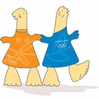
It just sad that Greece (the people who made the Olympics in the first place) had these as their mascots. They're actually supposed to be modeled after ancient terracotta dolls named daidala. Also they're named after the gods Athena and Apollo. Overall though, they look like upside-down feet... with feet. If mascots made in MS paint weren't already lazy enough with The Snowlets, now we have this.
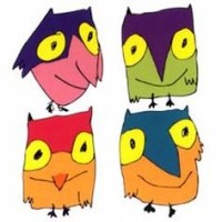
Made for the the 1998 winter Olympics in Nagano, Japan, these four snow owls look more like poorly drawn Batman cosplays made in MS Paint in five minutes. These four things are named Sukki, Nokki, Lekki and Tsukki. Why they chose these over a weasel named Snowple is beyond me. With poorly made smiles, and not even looking like owls at all, these are a disgrace to Japan. Luckily, Japan is redeeming themselves with the designs of Miraitowa and Someity, the mascots of the 2020 Summer Olympics and Paralympics.
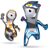
These two cyclops-looking disasters were created by Iris, a creative company in London. Most of the time, you can't help but think that they look like they were modeled after Kang and Kodos. They were supposedly made from drops of steel from the last girder of the Olympic stadium (according to a fictional storyline by author Michael Morpurgo, who also wrote the storyboard concepts of the animated shorts for the two mascots). Wenlock is supposed to represent the whole world coming to London, while Mandeville stands for friendship. Nevertheless, the two received a mixed reception and looked as good as the 2012 Olympics logo.
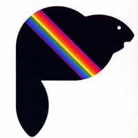
This "beaver" is supposed to be the mascot the Olympic games in Montreal in 1976. However, one look at this and you'll probably mistake this for roadkill. It doesn't even look like a beaver at all. In addition, they give it a sash. Maybe it was to hide the fact that it looks poor.
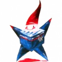
Made by Phillipe Mairesse for the Winter games in France. this guy was chosen over a mountain goat named Chamois. That decision was a poor one. Magique looks like a cross between a garden gnome and a Rubik's Cube. This one is just plain bad.
Created by Pedro Albuquerque, these nightmares were made for the 2006 winter games in Italy. These mascots are horrifying to say the least and more so than Hidy and Howdy. Just look at their eyes. They look stone cold killers just staring deep into your soul. Combined with their unnaturally large smiles, and you have yourself a mascot that will give you a two-weeks worth of nightmares.
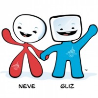
Made by Sheila Scott for the 88' Winter Olympics, this is just scary. While they're fine on paper, just look at them in costume form. The main problem are that the eyes fall squarely in the uncanny valley. This isn't help by the fact that staring at them for long periods of times make you uncomfortable. These are just wrong.
Created for the 2014 Sochi Winter Olympics, these three are again, not too bad. The problem is something that is quite common, the eyes look uncanny. This is especially prevalent on the polar bear. In addition, none of the mascots are named. Thus, Nobody knows what to call them.
Made for the Winter Olympics in Lillehammer, Håkon and Kristin are two human children in viking attire. They're not too bad, but they sure look depressing. Despite their smiles and nice designs, the eyes look tired and look like they're freezing to death. It's this high because they're not the worst designs ever. It just that the depressing designs hurt it.