Top Ten Brazil State Flags
I've seen a lot of lists about US states here on TheTopTens, but I don't really see any lists about the states of brazil. So you know what I'm going to do? I'm going to list the best flags of the states of Brazil, so with that being said, here's the list.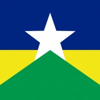
I just love the look of this one. It's generally simple but the layout looks amazing with the white star in the middle-top, surrounded by a blue rectangle to the top, a green triangle to the bottom, surrounded by two yello triangles. It kinda has like a wild west theme, and ironically, Rondônia is known as the wild west of Brazil. The colour combination of white, green yellow and blue is amazing as well and thus Rondônia's flag is number #1 for me.
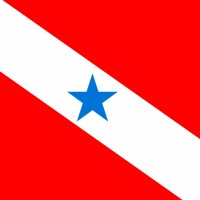
Pará's flag is generally simple with a diagonal white line on a redbackground, with a blue star in the middle. The simplicity kinda makes this flag so great though. I really love, the red colour in this flag. It looks so awesome. Not to mention the flag itself kinda reminds me of Peru's flag. So yeah.
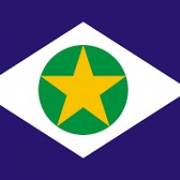
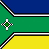
This looks kinda like Brazil's regular flag, but with the colours mixed up plus a star in the soccer ball instead of text. Blue background, white rhomb, green soccer ball, and then a yellow star in it, replacing the text and stars. It looks amazing as well.
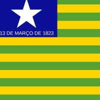
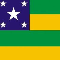
So there are three particular flags of Brazilian states that all look similar to each other. These states are Goias, Piaui and Sergipe. These flags are lined flags with green and yellow lines and a blue square to the top-left with stars. Piaui has one star plus text under it, Goias has five stars, and Sergipe is the same but only four lines. Piaui is the best of them because yes, while the text is in the way a bit, I like how it only has one star. It looks best so. Sometimes better have it simple.
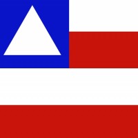
Aah, the state of Salvador, the gorgeous city. Bahia is the state with the longest coast line. It's also the state of a very beautiful flag. Four horisontal lines, two white and two red, with a blue square in the top-left corner, with a white triangle in it. That is just awesome I must say. Looks great
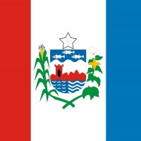
The best and biggest emeralds in the world come from this state
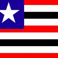
In a nutshell this flag looks like Liberia's, but every other red line is black. I really like it. It just looks so unique and original despite being simple. Man, Brazil's state flags really know how to look unique despite being simple. The colour combination isn't the best but it looks pretty good here.
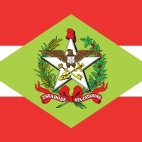
It's the austrian flag but with a giant golden rhomb with an emblem with it. The fact that it resembles the austrian flag a lot is enough for me to really like this flag. The red colour is just beautiful, and ironically, like how Austria is one of the safest countries in Europe, Santa Catarina is among the safest states in Brazil, if not the safest
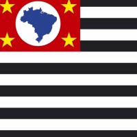
I just love how strong the flag looks like and its representation. Sao Paulo is the largest economy in Brazil and contains the biggest city, Sao Paulo, the powerhouse of Brazil. This flag really shows it. So many lines and the colours are amazing. To the top left corner is a minuature pic of the country of Brazil, symbolizing that this is the powerhouse of it. Amazing
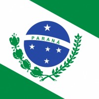
This one isn't as simple as the other ones on the list but looks splendid as well. Like with pará, a white diagonal line runs through the flag, but it's surrounded by green, and the line is thicker. In the middle is the soccer ball from the brazilian flag but it says "Paraná" and it's surrounded by some green twigs. I really like it.
This flag has some similarities when it comes to the design with South Africa's flag but less colours and a little bit different shape. It's hard to explain, but it's Czechia's flag but the white is blue, the red is yellow, and the blue is green, plus that a green line runs through the flag and between the borders of the colours can there be black and white lines. Plus there's some emblem on the left side of the flag. Man that was complicated. I like the flag though.
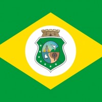
And here's another flag that greatly resembles Brazil's flag but even more than Mato Grosso's. In fact it's exactly the same, the only difference is that the soccer ball is replaced with an emblem on a white circle. Yeah. It looks good as well I must say.
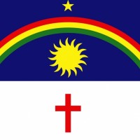
This is the most detailed flag of the bunch here and I gotta say the details are pretty beautiful. First off, it's divided between a lower white part and an upper blue part (although there's more of the blue than white), and on the white side there's a red christian cross. On the blue side, there's a rainbow containing red yellow and green. Under it is a yellow sun, and above the rainbow is a yellow star. I love these details. It makes the flag so much more interesting to look at.
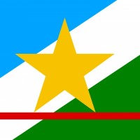
This flag is very nice. It has some similarities to its southern neighbour Rondonia but it's a bit less colourful. Still great overall. The colours are the same but a bit brighter or darker plus a red line at the bottom. Pretty beautiful
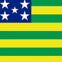
Worse than Piaui's flag but better than Sergipe's flag in my opinion.

And here's another flag with text on it, in fact it takes up the entire white part. Interestingly enough this is one of the only flags in the world to use pink. But at the same time it doesn't look super awesome. I do think this flag is still a bit decent.
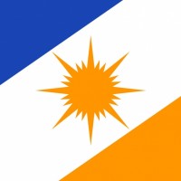
Orange is a rare colour on flags generally. The only notable national flags in the word to use this colour are Marshall Islands' and Sri Lanka's flags from what I'm aware of. The state of Tocantins, the newest state in Brazil also has orange though, on one of its sides and on the sun and it looks just beautiful.
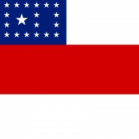
Another really good looking flag with a good shape and patterns. The red line on a white background with a blue square to the top left with stars in it looks pretty nice and good. I do think it looks not too colourful though due to the fact that white is the colour used for the background (it would've been better if white and red switched place) but it looks good nevertheless
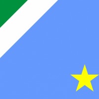
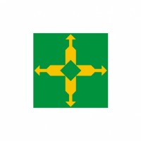
Not as good as Mato Grosso's flag but still fairly good I must say. Very original and unlike other flags. The yellow star is decent-looking and the blue colour is nice overall. Not much to say here but I think it looks good
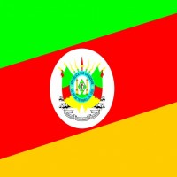
For being the most violent state in all of Brazil the flag looks rather chill and calm. It's a tricolour very similar to the french flag but the colours are a bit brighter and reversed, plus an emblem in the middle which looks pretty great, not going to lie. It just really looks good in my opinion.
Overall I like the colour scheme a lot. Green, red and yellow are colours found on the lithuanian flag which I highly adore. I do think however that it doesn't look super amazing or anything like that but I still like it
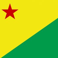
This flag is in my opinion alright but compared to a lot of other brazil state flags this one's a bit underwhelming at best. It looks almost identical to French Guiana's flag, but the star is in the top-left instead of the middle. I'm not saying that's a bad thing. I actually think that's neat thing but overall this one's not as good as other brazil state flags.
Seriously this flag is just the togolese flag but blue instead of red and some stars to it. It's very boring. Both Piaui and Goias have better flags in my opinion.
It's an alright flag but overall it doesn't look that good in my opinion. It reminds me a bit too much of the San Marino flag but a lot worse. I'm not a big fan of the white and blue combination and the emblem doesn't look that good in my opinion
This one's very underwhelming. I do like the emblem on the green and white colour combination but overall this flag just isn't that good. It's decent though.