Top 10 Most Iconic Video Game Cover Designs
-
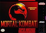
Mortal Kombat (1992)
-
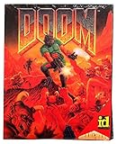
Doom (1993)
-
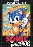
Sonic the Hedgehog (1991)
-
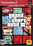
Grand Theft Auto III (2001)
-
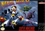
Mega Man X (1993)
-
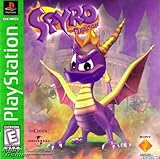
Spyro the Dragon (1998)
-
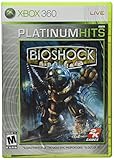
Bioshock (2007)
-
NieR: Automata (2017)

-
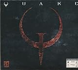
Quake (1996)
-
Assassin's Creed II (2009)
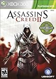
If the first installment with its mysterious cloaked figure already looked stunning, it was the sequel's artwork that has the protagonist, hood covering his eyes, facing the camera, weapons bared and ready to attack, that got kids and teens all over the world all hyped up. Everybody wanted to be that guy. Hoodies were worn all the more, and they made their own fake knives to pose just as mysteriously and menacingly as Ezio Auditore de Firenze does on the artwork.
-
?
Skate or Die

-
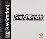
?
Metal Gear Solid
-
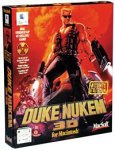
Duke Nukem 3D (1996)
-
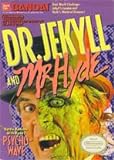
Dr. Jekyll & Mr. Hyde (1988)
-
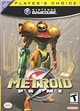
Metroid Prime (2002)
-
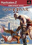
God of War (2005)
-
The Legend of Zelda (1986)
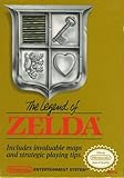
A shield split into four sections on a golden background. Often copied and parodied, instantly recognizable, the definition of an iconic design.
-
Portal (2007)

Portal is an emotionally complex experience, and the psychological manipulation by GLaDOS is a key factor, but this instantly recognizable iconography boiled the major gameplay gimmick that made it unique down into one image. You create a portal and go through.
-
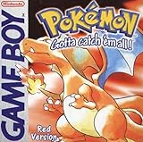
Pokemon: Blue (1998)
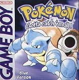
The Red and Blue versions of Pokémon were the first instance to introduce a wider public to what is now one of the biggest franchises in the world. The design choice of including a single strong looking Pokémon front and center became the premise for the main game series for decades. The iconic international logo font of the franchise was first established, and Ken Sugimori's trademark drawing and coloring style became deeply associated with the Pokémon games.
-
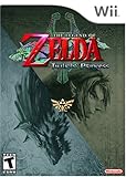
The Legend of Zelda: Twilight Princess (2006)
-
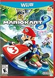
Mario Kart 8 (2014)
-
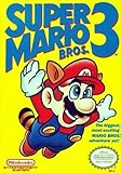
Super Mario Bros. 3 (1988)
-
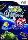
Super Mario Galaxy (2007)
-
Microsoft Entertainment Pack for Windows (1990)
It's probably impossible to find a better suited image for the spirit of the origins of PC gaming on Windows than the cover art of the Entertainment Pack. The font, design, and layout all remind you of a home office program rather than hours of fun and gameplay, but that was what it was, and that is what people in 1990 associated a Windows game with.
Even if just for nostalgic curiosity, that makes it kind of iconic.
-
Farming Simulator (2008)
Simulator games have been one of the most profitable casual game genres in Europe, and especially once let's players got ahold of them, everyone wanted to try one at least once. The Farming Simulator series is definitely the trendsetter here, and right from the start, it set the aesthetics that still to this day are associated with the genre: WordArt type font, a vehicle in the center, and "Simulator" in the title. They still do it like that, and people still instantly recognize what kind of game it is just by the cover design.
-
Pokemon: Red (1998)
-
The Original Moorhuhn Hunt (1999)
Barely known in the United States, Moorhuhn, or Crazy Chicken, was the biggest game in Germany at the beginning of the 2000s. This simple hunting game single handedly paved the way for PC gaming and caused nationwide media coverage for its impact on work ethic, regarding how many workers secretly played the game at work.
As a result, the iconic design of the chicken on the cover became a nationwide symbol, and it expanded into a huge franchise with multiple spinoffs, including games where the chicken is not supposed to be shot but is the hero in his own adventure story. It all started here.