Top 10 Good Music Albums with the Worst Cover Art
-
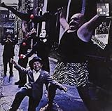
Electric Ladyland - The Jimi Hendrix Experience
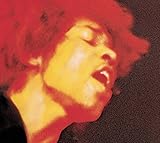
Here, you see the original cover that was replaced with Jimi's photo.
As you can see, there were many naked women on the original cover - 19 nude women to be exact.
Okay, not always would 19 naked women look bad, but I don't like them on this cover.
-
Stay Hungry - Twisted Sister
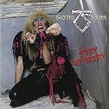
This is the album with their most popular songs: We're Not Gonna Take It and I Wanna Rock.
But the cover is plain awful.
-
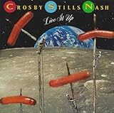
Live It Up - Crosby, Stills and Nash
-
Dance of Death - Iron Maiden

-
Yesterday and Today - The Beatles

This is the original cover that was replaced with a band's photo. For a reason.
-
Diamond Dogs - David Bowie
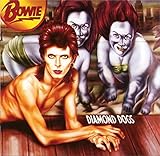
This cover is a huge mistake. And in this image, you do not even see the entire cover, where David Bowie's lower part of the body has dog legs (it continues on the back cover).
-
Love to Love You Baby - Donna Summer

An album that represents the music trends of the 70s (disco) - it is a good album from this subgenre, but its cover is a very cheap attempt at getting attention.
-
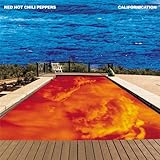
Californication - Red Hot Chili Peppers
-
Silk Purse - Linda Ronstadt

-
Stillmatic - Nas

-
?
Headache - Big Black
-
?
Tenacious D - Tenacious D

-
Pet Sounds - The Beach Boys

The music in this album was critically acclaimed. It was called a masterpiece. But this cover... oh boy, I cannot call it a masterpiece. I love animals, make lists about them, and all, but...
Ah, it is a funny cover. I think what bothers me more is the font and how outdated the idea of having a track listing on the front cover seems.
-
No Love Deep Web - Death Grips

I had never seen the uncensored version until today. It made me very uncomfortable.
-
Power Metal - Pantera

They look silly on the cover due to the '80s glam metal appearance, but the music in the album cannot be called bad. Because of this cover, many people probably concluded that the music was not good.
-
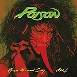
Open Up and Say... Ahh! - Poison
-
Around the Fur - Deftones

-
Bonded by Blood - Exodus

I am not talking about this thumbnail but the one with the naked babies.
-
Candy-O - The Cars

-
The Life of Pablo - Kanye West

-
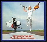
Get Yer Ya-Ya's Out! - The Rolling Stones
-
Meddle - Pink Floyd

-
Strange Days - The Doors
I love this album, but the cover freaks me out. Two guys (one is not tall at all, the other is very tall and very fat) have their arms spread out. One guy is juggling balls, and another guy is lifting yet another guy by the waist. It is weird.
-
Lana del Ray A.K.A. Lizzy Grant - Lana Del Rey

-
The Uplift Mofo Party Plan - Red Hot Chili Peppers

-
Streisand Superman - Barbra Streisand
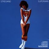
How did this classy woman agree to this? Oh, probably Superman made her.
-
Kollegah - Kollegah

Kollegah. I love your music, man.
I love the way you twist and turn the German language around to bring a whole new meaning to phrases, idioms, and proverbs by completely deconstructing them. I love that in each line almost every syllable rhymes with at least one other. And I love your entire over-the-top gangsta attitude - especially on this great, great, great hip hop record where you are much more light-hearted and humorous than on your usual sinister street-oriented albums.
But heck, this monstrosity of an album cover is inexcusable. Where did he find this background? Was this a pre-installed screensaver on a '90s computer (the album is from 2008)? What happened to his left arm? Why is it so long? And why does his face look like that of a 12-year-old? One year later, he looks like a menacing biker on the cover. Who designed this logo? An insurance company? There was a time when I seriously considered printing a cover myself and exchanging it.