Top 10 Worst Dressed NHL Teams of 2017-18
This list compiles the NHL teams that were the worst dressed when they hit the ice during the 2017-18 NHL season.
-
Vancouver Canucks

The Vancouver Canucks are a professional ice hockey team based in Vancouver, British Columbia. They compete in the Pacific Division of the Western Conference of the National Hockey League. The team was founded in 1970 and has appeared in the Stanley Cup Finals three times.
I'm sorry, but the blue/green/white combo doesn't look fresh like it used to. The 'stick in the rink' jersey, had it been active this year, would've helped bump the Canucks down a few spots (or up, depending on your perspective of "worst" lists) on the list since it's the franchise's first and best look.
I think the team could stand to dump the green on their primary and away jerseys. Perhaps that's all it'll take to help out a team that can't find any love on the ice or on their sweaters.
-
Washington Capitals

The Washington Capitals, commonly known as the Caps, are a professional ice hockey team based in Washington, D.C. They compete in the National Hockey League as a member of the Metropolitan Division of the Eastern Conference. The team is owned by Monumental Sports and Entertainment, led by Ted Leonsis.... read more
The jerseys are a weird design, first off. There are stripes and bands in all the wrong places and the whole thing looks cluttered. Then there's the "primary logo," which needs to be downgraded to "text logo" yesterday while the eagle "W" logo deserves its place at the center of a sweater.
I mean, look at the logo in the image to the left. From a distance, it looks like somebody took a picture of an incomplete game of pick-up sticks and made it a logo. I get that it's an update of their original 1974 logo, but the 1970s was an awkward era for logo design. Look up the logos used in the old WHA, and you'll see what I mean.
-
Ottawa Senators
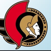
The Ottawa Senators (French: Sénateurs d'Ottawa) are a professional ice hockey team based in Ottawa, Ontario. They compete in the National Hockey League (NHL) as a member of the Atlantic Division in the Eastern Conference. The Senators play their home games at the Canadian Tire Centre, an 18,652-seat... read more
This team NEEDS to switch to their "O" jerseys. Their center ice logo is the "O," for Pete's sake. Ever since the Reebok Edge jersey switch, the team has been one of the dullest-looking teams on the ice.
The patterning (which I believe is identical to the Penguins' old jerseys) maybe looked modern in 2007 when it was unveiled, but most teams that started off with Edge jersey templates switched out of them once they woke up and smelled the boring. I'm expecting a rebrand for next season. Let's hope my (and pretty much everyone else's) expectations are met.
-
Los Angeles Kings

The Los Angeles Kings are a professional ice hockey team based in Los Angeles, California. They are members of the Pacific Division of the Western Conference of the National Hockey League. The team was founded in 1967 and has won two Stanley Cup championships, in 2012 and 2014.
Aside from the first few teams listed (in the order that originated with me, anyways), most of the teams are primarily guilty of looking dull, not outright ugly.
The Kings are an excellent example of a team that used to be gorgeous (with the royal blue and gold) but has decided to take the colorless route in recent years and uses black as their primary color. I do admit to liking the Gretzky-era black and white uniforms, which their current set is similar to, but also inferior to. The horizontal lines that stretch from arm to arm clutter up the jersey. The letter and number font is cartoonish when it should look solid and angular like most teams in professional sports (I'm a supporter of basic varsity fonts on jerseys), and the crest simply isn't as good as the 1988-1998 one.
-
Columbus Blue Jackets

The Columbus Blue Jackets are a professional ice hockey team based in Columbus, Ohio. They compete in the Metropolitan Division of the Eastern Conference in the National Hockey League. The team was established as an expansion franchise in 2000 and began play in the 2000-2001 NHL season.
This team has always been on the unattractive side of the league. First, they had a logo with lime green in it, which was not a good idea. It wasn't until this season that they ditched their old letter and number font (which was easily among the worst ever to disgrace a hockey jersey), so that helped them out a tad.
However, the overall design of their jerseys is boring. They need to get more creative with the striping. Take a few pages out of the Bruins' book, maybe. That kind of striping could really make a difference because the primary logo is great and deserves better.
-
Arizona Coyotes
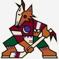
The Arizona Coyotes were a professional ice hockey team based in the Phoenix metropolitan area. They were a member of the Central Division in the Western Conference of the National Hockey League (NHL). The team was originally established as the Winnipeg Jets in 1972 before relocating to Arizona in 1996... read more
I don't get the black shoulders. They've had them since 2015 (a year after they changed their name from "Phoenix" to "Arizona"), and they look awkward. I understand the decision to incorporate more black into the jerseys (since black is a part of all their logos), but the execution isn't great.
-
Tampa Bay Lightning

The Tampa Bay Lightning are a professional ice hockey team based in Tampa, Florida. They compete in the Atlantic Division of the Eastern Conference of the National Hockey League. The Lightning have won three Stanley Cup championships during the 2003-04, 2019-20, and 2020-21 seasons.
The team has never been stand-out stylish, but their decision to replicate the look of the Leafs, while upgrading their overall look, made them the most unoriginal team in the league. They're practically a carbon copy of the Leafs' uniforms, save for a lightning bolt on their shorts.
-
Nashville Predators

The Nashville Predators are a professional ice hockey team based in Nashville, Tennessee. They are members of the Central Division of the Western Conference in the National Hockey League. The team was established in 1998 and plays its home games at Bridgestone Arena.
They simplified their jerseys for the 2017/18 season, and I don't know why. They were maybe the only team to make piping look good, and they ditched it. The whole "guitar string" number idea matched really well with the piping going down the chest, so now that half of that combo is gone, it makes the other half look a little out of place.
The chest logo already looked sort of small in the center of the jersey, so now it looks like it's in the middle of an ocean of gold (or white) nothingness.
-
St. Louis Blues
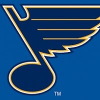
The St. Louis Blues are a professional ice hockey team based in St. Louis, Missouri. They are members of the Central Division in the Western Conference of the National Hockey League. The Blues won their first Stanley Cup championship in 2019.
The team's uniforms were garish from 2008 to 2014 when they had that awful Reebok Edge piping thing going on. They went back to their 1998-2007 look at the start of the 2014/15 season, but what they should've done was gone back to their 1967-1984 digs because the dark blue really doesn't do anything for the Blues.
-
San Jose Sharks
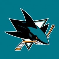
The San Jose Sharks are a professional ice hockey team based in San Jose, California. They are members of the Pacific Division of the Western Conference of the National Hockey League. The team was founded in 1991 and plays its home games at the SAP Center at San Jose, often referred to as the Shark Tank... read more
I like the teal, make no mistake. There's just not a whole lot to look at with these jerseys. The emblems are fine, the fonts are fine, the color scheme is decent (they should either use more orange or get rid of it altogether to make it work), but there's not much passion behind the design.
-
?
Carolina Hurricanes

The Carolina Hurricanes are a professional ice hockey team based in Raleigh, North Carolina. They are members of the Metropolitan Division of the Eastern Conference of the National Hockey League. The team won its first Stanley Cup championship in 2006.
-
?
Chicago Blackhawks

The Chicago Blackhawks are a professional ice hockey team based in Chicago, Illinois. They compete in the Central Division of the Western Conference in the National Hockey League. Since their founding in 1926, the Blackhawks have won six Stanley Cup championships, with their most recent title coming... read more
-
Montreal Canadiens

The Montreal Canadiens (French: Les Canadiens de Montréal) are a professional ice hockey team based in Montreal, Quebec. They compete in the National Hockey League (NHL) as part of the Atlantic Division of the Eastern Conference. Founded in 1909, they are the oldest continuously operating professional... read more
-
Dallas Stars

The Dallas Stars are a professional ice hockey team based in Dallas, Texas. They are members of the Central Division of the Western Conference of the National Hockey League. The team was established in 1967 as the Minnesota North Stars before relocating to Dallas in 1993.
-
Buffalo Sabres

The Buffalo Sabres are a professional ice hockey team based in Buffalo, New York. They are members of the Atlantic Division of the Eastern Conference of the National Hockey League (NHL). The team was established in 1970 and has made multiple playoff appearances.
-
Anaheim Ducks
The Anaheim Ducks are a professional ice hockey team based in Anaheim, California. They compete in the National Hockey League (NHL) as a member of the Pacific Division of the Western Conference. Since their inception in 1993, the Ducks have played their home games at the Honda Center. The team was originally... read more
-
New Jersey Devils
The New Jersey Devils are a professional ice hockey team based in Newark, New Jersey. They compete in the National Hockey League (NHL) as a member of the Metropolitan Division in the Eastern Conference.
The franchise began in 1974 as the Kansas City Scouts in Missouri. It then moved to Denver... read more
-
Edmonton Oilers

The Edmonton Oilers are a professional ice hockey team based in Edmonton, Alberta. They compete in the Pacific Division of the Western Conference in the National Hockey League. The team has a rich history, including multiple Stanley Cup victories during the 1980s with Wayne Gretzky.
-
Toronto Maple Leafs

The Toronto Maple Leafs, officially the Toronto Maple Leaf Hockey Club and often simply referred to as the Leafs, are a professional ice hockey team based in Toronto, Ontario. They compete in the National Hockey League (NHL) as a member of the Atlantic Division of the Eastern Conference. The team was... read more