Top Ten Worst Pokemon Designs
While the Pokémon franchise has had many well designed Pokémon, there are also Pokémon whose designs are boring, ugly, or uncreative. This is a list for those Pokémon. There are, of course, more Pokémon than the ones originally on the list who have bad designs, so feel free to submit them!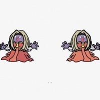 Jynx, known in Japan as Rougela, is a Pokémon species in Nintendo and Game Freak's Pokémon franchise. She is known as one of the more humanoid pokemon.
 While there are many humanoid Pokémon I could put on this list, such as Mr.Mime, Sawk, and Throh, which have bad the designs, I chose Jynx for a number of reasons, most of which you've probably heard before. First off, its design bears resemblance to a certain horrible musician. Second, there's its original design, which of course had racist implications. Thirdly, its just plain uncomfortable to look at, especially its 3-d model, which has it swaying in a weird, hypnotic pose.
Designer 1: let's make Nicki Minaj a pokemon!
Designer 2: good idea!
 Muk, known in Japan as Betbeton, is a Pokémon species in Nintendo and Game Freak's Pokémon franchise.
 While the concept of a slime monster is interesting, it was not executed well with Muk. Muk is literally just a pile of sludge, and unlike Grimer, it doesn't even have a pleasant expression on its face.
It's literally decomposing feces. How kid friendly and adorable! Even Mega Kangaskhan had more thought put into it!
I don't care what you say Muk is still one of my favourite Pokemon!
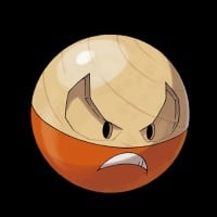
In the credits of the I Choose You movie it shows the Poke Balls and as a joke they put Voltorb in there as well. Which means, if Voltorb is an exploding Poke Ball, why not make Electrode an exploding Great Ball!? Yes, the shinies are references to Great Balls, but why not change Voltorb to black (Ultra Ball) and Electrode to purple (Master Ball)? Oh well. Just a thought. Other than that Voltorb/Electrode is atrocious design-wise.
Designer 1: Let's make an evolution of Voltorb. Let's call it Electrode.
Designer 2: Let's be "creative"!
Designer 1: I think we should make it bigger and put a different face on it!
Designer 2: No, that is too easy. Why don't we flip it over too?
Designer 1: Wow, that looks like a wonderful new Pokemon!
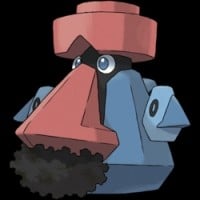 Probopass, known in Japan as Dainose, is a Pokémon species in Nintendo and Game Freak's Pokémon franchise.
 This Pokemon is so bad looking I had to vote for him. The first time I ever battled a Probopass in game I burst into giggles. Seriously my friend and I had a good laugh over this guy. If nothing else at least his design amuses me.
That Pokémon looks really stupid-looking. It looks like an Easter Island head statue that was painted blue and red by some painter and someone decided to give that Easter Island head statue a mustache.
Probopass is ugly, It's a copy of Mario because it has a red hat and a moustache like Mario!
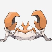
Krabby, just as its name suggests, is a crab. At least Kingler did something slightly interesting with the concept, but Krabby really didn't.
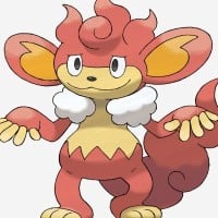
There's a reason this Pokémon was voted the least popular of all time in Japan. My criticism here could apply to all of the elemental monkeys, but in my opinion, Simisear looks the stupidest. From its ugly oversized ears, to its annoying expression, to the fact that the elemental monkeys are basically the same thing with changes to match each monkey's type and attribute of the whole "three monkeys" legend thing.

Designer 1: hey guys I have an idea! Lets have a seal Pokemon with a horn!
Designer 2: great idea! but what should we name it!?
Designer 1: hm it's a seal so lets replace the a with an e!
Designer 2: WOAH!
Seel is literally a seal. That's it. Like I've heard people say before, if you showed a drawing of Seel to someone, they probably wouldn't be able to tell that it was a Pokémon.
Sure just get a seal put a horn on its head, and replace the A with an E and you just created Seel!
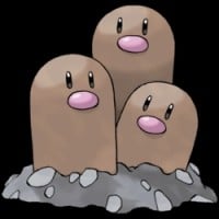
Dugtrio isn't creative, but how creative COULD THEY BE?
So they made Diglett, Diglett was a good Pokemon. He was a cute little mole that nobody ever saw the full body of. Well, the designers wanted it to evolve but what was it supposed to evolve into? They couldn't just leave Diglett like that and call it a legendary Pokemon! There's nothing legendary about Diglett. So they had to evolve it. There wasn't anything they could really do to be creative. So they had to do what they could, make three Diglett heads. It's not that bad of a Pokemon...
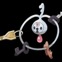 Klefki is a dual-type Steel/Fairy Pokémon introduced in the Pokémon franchise's sixth generation. It is known for its unique design, resembling a set of keys. Klefki's ability to collect keys and small objects adds a playful element to its character. Its Steel and Fairy typing makes it effective against... read more
 Designer 1: Lets make another fairy type Pokemon.
Designer 2: I got a brilliant idea! It should be a-
Designer 3: *Fidgets with key chain*
Designer 2: What is he doing?
Designer 1: Screw your idea, a key chain Pokemon is probably the best Pokemon idea ever!
There's potential for a good design here. Maybe you could make it angel-based and have the "ring" be a halo above it's head, or use the keys as fingers for the monster? Anyhow, it had potential, but it comes out really half-baked in the end.
Game freak!? Are you serious!? The pokedex REALLY says ''It shakes its keys to scare its enemies away'', that is so stupid! The next time I see my worst enemy I'm gonna just shake my keys! This is a bad design itself, just a keyring with keys on it. I sort of like Klefki I guess but it needs to be fairy/steel or something
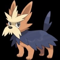
Similar to Seel, Herdier just looks like a dog. While I know many people like dogs, when you're trying to make a Pokémon, you shouldn't make it look exactly like a real life animal. Plus, there are already better dog-based Pokémon out there.
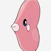 Luvdisc, known in Japan as Lovecus, is a Pokémon species in Nintendo and Game Freak's Pokémon franchise.
 Remember back when gen 5 came out and aLOLamola came out? That would've been great for BOTH of them, and possibly, Luvdisc wouldn't be looked at as a bad Pokemon. But no. a-lol-amola ISN'T the evolution. It's just another pointless water Pokemon they through in there to get rid of space. Gen 5, in my case, is just one of the worst generations for Pokemon design. SERIOUSLY! You have an ice cream cone, a bloodshot eyed rat, dumb looking monkeys, chandeliers, and... a mountain of trash? Also, the names black and white just make it seem ever more worse. BLACK and WHITE? Ugh... dull, ugly colors- BLECH! What I'm saying is that that Alooolamola should get the record for the most confusing Pokemon because it looked like luvdisc.
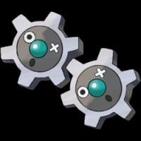
Klink is just a pair of two gears. The whole evolution line is just gears. Klink doesn't even have a particularly pleasant expression. Its mouths are open in expressions of shock, and both of the have an x instead of one of their eye.
It doesn't look like it fits in with other Pokémon of the franchise. It would fit better as being a One Piece character instead, if One Piece does have modern-styled gears. That's how out of place it looks.
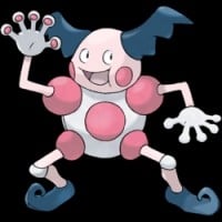 Mr. Mime, known in Japan as Barrierd, is a Pokémon species in Nintendo and Game Freak's Pokémon franchise.
 I DETEST Mr. Mime. Its feet are weird, it has odd joints, and its face... its face is LITERAL NIGHTMARE FUEL. And its 3D sprite will haunt me forever. I don't really like mimes that much, and Mr. Mime just makes it worse. I compare it to a festering wound you cannot get rid of. It's always there, pantomiming walls with its face that says "I will murder you." When I encounter one, I send out a Pokémon and just let them destroy the creepy thing. And this is coming from the person who likes Garbodor and Stunfisk. (Sorry for bad grammar.)
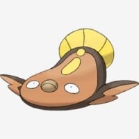
Read his description. He can get stepped on by a SUMO WRESTLER and be unhurt.
Sumo: steps on Stunfisk
Stunfisk: *smiles* shocks sumo with massive volt of electricity
Sumo: *extra crispy*
I think he is cute and unique. Awesome typing. I think it may be based off of the stargazer, a fish that spends its time buried in the ocean floor and is electric. Unfortunately, the ORAS and X and Y sprites are...flat, to say the least. Not flat like "no detail" flat, flat like...flat. Very flat.
I don't know what this thing is, but it looks very much like a deformed flounder.
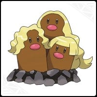
Before you guys get on me about it, I know what Pele's hair is. I just wish the concept was executed better than just sticking wigs onto Dugtrio. At first it was funny, but now it's just really stupid.
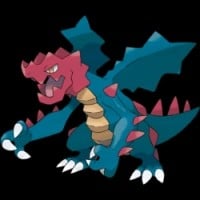 Druddigon, known in Japan as Crimgan, is a Pokémon species in Nintendo and Game Freak's Pokémon franchise.
 Druddigon isn't a bad Dragon-type design! It looks really cool and ferocious, not to mention frightening. It's probably the Dragon-type that looks most like a dragon. Dragons are supposed to be scary, violent, and angry; and Druddigon has all of those traits. Its red head? GameFreak probably gave it such a head in order to make it more frightening, like a gargoyle. Anyways, it's a creative Pokémon that doesn't deserve to be on this list!
I wouldn't be surprised if one of Game Freak's designers had a kid who threw this design as a drawing they made in elementary school and begged to have it put in the game.
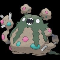 Garbodor, known in Japan as Dustdas, is a Pokémon species in Nintendo and Game Freak's Pokémon franchise introduced in Generation V. It is categorized as the Trash Heap Pokémon.
 You cannot make me hate Garbodor! Trubbish is cute, and I have a really strong Garbodor card. Also, I thing Garbodor is funny.
I'm just glad he's not as high up on this list as Muk. Come on, don't hate on Garbodor when they made a literal POOP Pokemon!
I will tell you why: Because Garbodor is awesome! And I want a garbage Pokemon! He's awesome and nomatter what you say you can't make me hate Garbodor
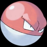 Voltorb is an Electric-type Pokémon introduced in the Pokémon franchise's first generation. Resembling a Poké Ball, Voltorb often surprises trainers by self-destructing in battles. Its unique design and explosive abilities add an unexpected element to battles, making it both a challenge and a strategic... read more
 It's one thing to make a Pokemon based on an object, but it's quite another to slap a face on a fictional one and call it a PKMN.
Seriously.
Why does Voltorb exist? ANYTHING would be better than this. At least Electrode was SOMEWHAT original.
All right we have 148 Pokemon so far what should we do next? I know let's get a poke ball, stick eyes on it and have it evolve into a upside down poke ball with eyes
Hands down the worst Generation I design, if not the worst in the entire series? What's so special about a Pokeball with a face?
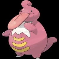
This thing looks very unattractive.

While Castform is a cute Pokémon and has its weather-based forms, that's basically all that it's got going for it. Not only does it stink in battle, its normal for has a boring color scheme, and the "questionable" grey things below its head.
Why does it have boobs Is it going for the sexy weather girl look?
For real just look at what's below Castform's head.
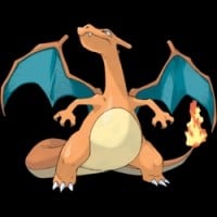 Charizard, known in Japan as Lizardon, is a Pokémon species in Nintendo and Game Freak's Pokémon franchise. Created by Ken Sugimori, Charizard first appeared in the video games Pokémon Red and Blue and subsequent sequels. They have later appeared in various merchandise, spinoff titles and animated... read more
 This shouldn't be on the list... The only reason people think it is strong because its design and anime. If it is bad in design, no one would have liked it
I should send in a photo of my level 100, max EV and IV, Mega Charizard Y. Because that's what you Charizard haters need.
I like how when people make fun of some of the admittedly generic Pokemon designs from Pokemon Blue & Red like Seel and Pidgey, no one will dare bring up the STRAIGHT UP DRAGON design.
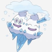 Vanilluxe is an Ice-type Pokémon introduced in Generation V. It evolves from Vanillish. It is the final form of Vanillite. It is known as the Snowstorm Pokémon.
 Its not an ice cream cone, Its an icicle with snow on top. The pokedex doesn't say, so, its not. And why do you say this is a bad design in one of the newer games when the older ones were crappier? Vanilluxe will always be one of my favourite Pokemon and you cannot make me hate her
Designer 1: Hmmm. What new Pokemon we should add too the Vanillite family?
Designer 2: What about we add another head to Vanillish?
Designer 3: Not a bad idea. I just type that in the code. BEEP BOOP BLOOP
Man: What is that Pokemon?
Boss: You 3 are fired.
 Unown is a Psychic type Pokémon from the Johto region, taking on the form of letters and punctuation. It is often considered the weakest Pokémon, with low stats and access to only one move, Hidden Power (which can be learnt by nearly every Pokémon anyway)
 This is a terrible Pokemon, it wastes a whole room in Pokemon heart and gold and its really annoying when you have to catch them to get awards
Alphabet Soup is more like it all it need to alphabet soup is well soup
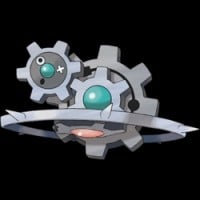
If you thought voltorb was bad, here are three magnetmites stuck together.
I can go all day with this.
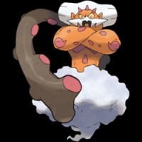 Landorus, known in Japan as Landlos, is a Legendary Pokémon species in Nintendo and Game Freak's Pokémon franchise.
 Landorus' new form just looks like a really angry cat.
True that. It looks like the genie from Aladdin.