Top Ten NHL Reverse Retro Jerseys
For the upcoming 2020-21 NHL season, a league-wide initiative has been launched that will see every NHL team sporting a retro-inspired uniform that combines classic designs with a modern twist. While some teams' jerseys have been very well received, some have sparked online debates for their unusual combinations and underwhelming designs. This list ranks each "Reverse Retro" NHL jersey from first to worst.
-
Colorado Avalanche
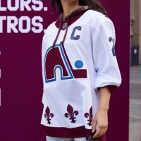
Combining the Av's colour scheme with their predecessor, The Quebec Nordiques', logo and jersey design? Fans simply couldn't ask for a better throwback. This one's going to do very well, sales-wise. Even I want one.
-
Los Angeles Kings
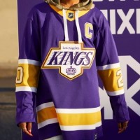
This design brings the best two designs in team history together in perfect harmony. The Forum blue and gold colour combo blended with the Gretzky-era design makes a regal pairing if there ever was one. Why did they ever give up on their original colours, anyway? They're fantastic together.
-
Montreal Canadiens
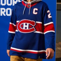
The team has sported the same iconic symbol (with minor alterations) for over 100 years, so it'd be difficult for the team to swap it out in favour of anything else. They could have gone with the globe logo used in their 1924-25 season. And they could have opted for a white "C" logo as they have in the past. Instead, the team has debuted a simple colour reversal to their current look that, honestly, feels like it should have been given a try decades ago. It's clean. It's classic. It gives blue the spotlight for the first time in team history. It's a winner.
-
Carolina Hurricanes
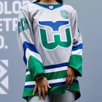
Nothing will take the sting of losing the Hartford Whalers away from hockey fans in Connecticut, but this beauty of a throwback might be the best the team can do. It's a mostly-identical recreation of their predecessor's perfect look, albeit with a grey base. Why add grey, you ask? It's the only colour both the Whalers and Hurricanes ever had in common.
-
Boston Bruins
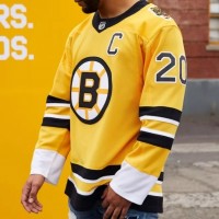
Boston's tried yellow jerseys before, with the most memorable example being the "Pooh Bear" jersey used from 1995 to 2005. Now, it's making use of the team's longest-active primary logo (used from 1949 to 1995), and seeing it back in all of its Original Six-era glory reminds me of why it lasted for so long. It's clean and simple and looks great. Welcome back, old friend. I not-so-secretly wish this was still the team's logo.
-
New Jersey Devils
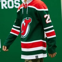
The team may be the Devils, but this beauty is angelic. Much like the Canadiens, the team is running with a simple colour swap. Green is back from their old days and is now the primary colour with red accents. Sometimes the simplest changes are the best.
-
New York Rangers
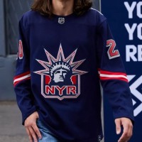
The Lady Liberty logo is back! The simple arm stripes create a design that, while a bit on the basic side, manages to compliment and bring full focus to the fan-favourite crest. Even if the arms were bare, this jersey might have still earned itself a spot in the top ten. The logo's that good.
-
Washington Capitals
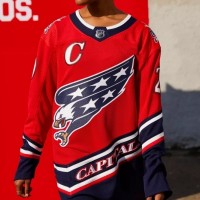
I'm outspoken about how I loathe the Cap's look. The striping is crap and their glorified wordmark is hardly credible as a primary logo. What we have here is the return of "Screaming Eagle" design used from 1995 to 2007 with the team's current colour set. A great mix of the team's best design and their best colours. Well done.
-
Ottawa Senators
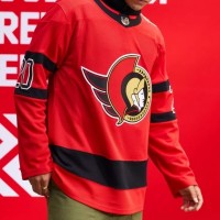
Something I'd always wanted to see was the original (and once again current) Centurian logo on a bed of red. Now I have my wish and I'm not disappointed. Adopting everything from the current jersey design, but with red as the primary colour, this design could very easily be elevated to a full-time alternate jersey following its use this season.
-
Philadelphia Flyers
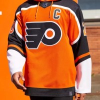
Same logo as always. Nothing new (needed) there. And the design is familiar. It was the team's longest-lasting jersey template (used from 1982 to 2007), yet it's unique handling of the team's signature orange and black makes it stand out. Another simple, yet satisfying, alteration to a classic look.
-
?
Detroit Red Wings
-
?
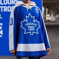
Toronto Maple Leafs
-
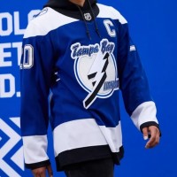
Tampa Bay Lightning
-
Chicago Blackhawks
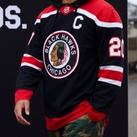
Back is the full-colour vintage circle logo that hasn't been seen since it was last used on an alternate jersey in 2011. This time, however, it sits on a simplified jersey without a multi-coloured stripe across the chest. I admit that I prefer the look from before but this design comes close to being just as good.
-
St. Louis Blues
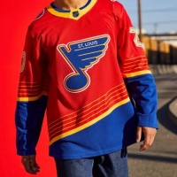
From 1995 to 1998, the Blues used red in their colour scheme. If you swapped the red and blue from this jersey, you'd have that era's dark jersey. It may seem a bit odd to see so much red on a Blues jersey (for multiple reasons), but the end result is actually quite nice. The yellow trimming really makes the colour reversal pop.
-
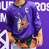
Arizona Coyotes
-
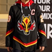
Calgary Flames
-
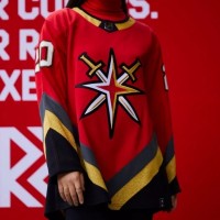
Las Vegas Golden Knights
-
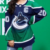
Vancouver Canucks
-
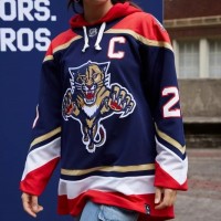
Florida Panthers
-
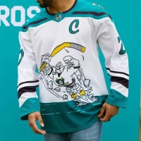
Anaheim Ducks
-
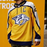
Nashville Predators
-
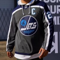
Winnipeg Jets
-
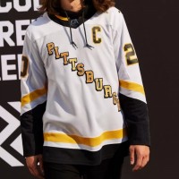
Pittsburgh Penguins
-
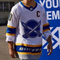
Buffalo Sabres
-
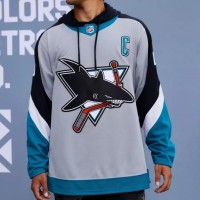
San Jose Sharks
-
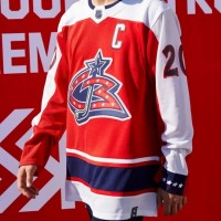
Columbus Blue Jackets