Top 10 Music Album Covers Featuring Naked People
The idea of this list is to discuss album covers and not the music on the albums (but you can share your opinion about the music, too).
I noticed these things about album covers of this type:
1. Covers with naked people can be both beautiful and disgusting.
2. There are covers that are done tastefully and covers that are just cheap attempts at getting attention (i.e., selling an album with probably bad music).
3. Images can be sexualized or not.
4. Some images of naked people are disgusting, but this is done on purpose because it reflects the album's concept.
I put on this list covers I like and covers I dislike.
You can click on the images to zoom in.
What do you think about these album covers?
-
Immersion - Pendulum

THIS. By far. Everything is perfect about it. The futuristic silver font, the beauty of the underwater world, the light touching everything just slightly, making it seem shiny, and the fascinating beauty of the natural human body.
I even own this album because back then they had a hit over here with "Watercolour." Then they vanished and were forgotten. I must admit I also completely forgot about them. I need to check this out again.
-
Fallen - Burzum

I would say this is very tastefully done - she looks like a Greek Goddess and the image isn't sexualized because the private parts aren't accentuated.
And yes, Burzum is the black metal band founded by Varg Vikernes (non-metal fans know him mostly for killing a bandmate).
Info about this cover:
The cover art is taken from the painting Elegy (1899) by French painter William-Adolphe Bouguereau. Varg Vikernes, the musician behind this album, said, "We mastered the album as if it was classical music."
I would agree with Martin that it looks pretentious. Nevertheless, I prefer it over most of the covers on this list.
-
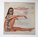
Blooming Hits - Paul Mauriat
-
The Pros and Cons of Hitch Hiking - Roger Water

Her booty was censored in this image.
-
Nevermind - Nirvana
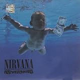
The difference between this and the Virgin Killer cover is that the latter is sexualized.
There are also cultural differences: nudity is much more common and accepted in German media (you can see it on TV during daytime), as is sexuality. Especially in the '70s, sex, pornography, and nudity were used heavily in the arts in Germany. The cover and title referenced a song lyric about a child being born innocent but losing this innocence over time. Pedophilia was not discussed in Germany until decades later, or rather, child nudity was not as controversial back then. I doubt they actually intended it to be that shocking.
The album was never banned or indexed in Germany, but most recent pressings have the international cover. I don't think such a cover could be made in Germany nowadays. A sexualized pose would require the model to be at least 14 years of age due to that being the German age of consent.
This extremely open use of a sexual image, especially in the context of it being a 10-year-old, shocked Americans who were not used to that. On Nirvana's cover, the baby was naked but not sexualized.
-
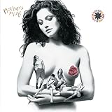
Mother's Milk - Red Hot Chili Peppers
-
Nothing's Shocking - Jane's Addiction

Not one, but two bare naked ladies on a cover for an album titled "Nothing's Shocking."
-
Houses of the Holy - Led Zeppelin

-
Balance - Van Halen

I love the '90s aesthetics, even though they varied greatly in America and Europe (America was rock-oriented, Europe was techno-oriented). It looks very nightmare-ish and surreal, with a threatening red color scheme and extremely artificial lighting.
Yup, this is the kind of art I really like. Daring, scary, and extreme, but in its overall tone still very aesthetic and of a high stylistic and artistic quality.
-
Earth Blues - Spiritual Beggars

@Martin - thanks for your great comments on this list. I don't agree with everything, but it isn't necessary. I still think your comments are great.
More info about this cover: they can't change the font because it's the band's logo that appears on every album. This album came out in 2013, but yes, their music style is inspired by the '60s-'70s, and also the aesthetic. I agree it's very LSD-ish, but this LSD-ish thing fits the music on the album because they play stoner music.
I like it. It looks rather romantic and sad. It isn't sexualized. I also like the music on this album (stoner rock/metal).
-
?
Stagger - Poppy
-
?
Aftercare Deluxe - Nessa Barrett
-
Fijacion Oral, Vol. 1 - Shakira

Shakira always has decent covers, just like she makes decent music. I know it probably wasn't her idea to shoot this picture, but it is still so fitting for the music. Classy and with much grace, she shows us the wonder of being a mother. The album itself is one of her calmest and least pop-like and feels very personal and often introverted.
(Another one of my favorite albums out there.)
-
Snakes for the Divine - High on Fire

-
Indelibly Stamped - Supertramp
-
Lovesexy - Prince

I always appreciated how Prince played with gender stereotypes and had a lot of feminine aesthetic. I think this cover is beautiful, but to be honest, the hair on his chest and his beard kind of ruin it a bit, as they are associated with masculinity.
@OnionLists - I know he liked women, so maybe bisexual?
-
Electric Ladyland - Jimi Hendrix
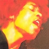
The true story about Electric Ladyland was that the original album cover was going to be 19 naked women. But, it was too racy and it was replaced with a picture of Jimi Hendrix.
On the original cover, there were 19 nude women! It was banned and replaced with Jimi's photo.
-
Hooked - Great White

Yes, this is a very aesthetic mixture of sexual pleasure and pain, and the grey overall tone in contrast to the colorful woman looks fantastic. The hobby psychologist in me is über happy.
-
Oral Fixation Vol. 2 - Shakira

-
Pressure Drop - Robert Palmer

-
Dark Side of the Spoon - Ministry

I am... not very sure what this is supposed to tell me. I guess the person (Man? Woman?) is humiliated in the worst way possible. The American flag may indicate a sociocritical interpretation... but I don't know this artist. Could also be a simple showcase of tasteless humor.
-
Mechanical Animals - Marilyn Manson

I love Marilyn Manson. This is his best album with the best cover artwork.
Not only does he continue to intelligently trigger American prudeness, but he also does it with a never-before-seen beauty. His other albums look disturbing and shocking, trying to trigger the debate on the impact of violence in media on kids, but this is different. It looks very artistic and like something out of a surreal cyberpunk dream, yet still became notorious for its depiction of genderlessness.
Album, cover, and impact: 5 out of 5.
He is not literally naked, but the rubber suit he wears has boobs on it, and he looks naked.
-
Teenage Dream - Katy Perry

It fits the tone of the album. I mean, there are cotton candy clouds, and on my copy of the album, there is a font resembling candy canes that says "Teenage Dream," as well as a Katy Perry logo that could be red icing.
That is all very sugary and sweet, and so is the album.
-
Forbidden Fruit - Hot R.S.
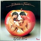
A naked couple making love in an apple. It's not ugly. It looks rather romantic.
I liked the image on the apple. It reminded me of Adam and Eve.
-
My Beautiful Dark Twisted Fantasy - Kanye West

Kanye is a great artist with some of the most excessive and extreme music I have ever heard. He stopped making easy-listening hip hop a long time ago and since this album only lets his twisted mind flow, often surreally. In context, this works perfectly - sex, alcohol, and modern arts. On its own... it's ugly.
But the album is my personal favorite American hip-hop album.
-
Virgin Killer - Scorpions (Original Cover)
1976 LP. The original cover art depicts a nude 10-year-old girl, provocatively posed. Probably the most scandalous album cover image of all time. It was immediately banned and replaced with a group photo.
You can get a Japan import on the German Amazon, and it also has the original cover.
-
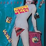
Undercover - The Rolling Stones