Top Ten Germany State Flags
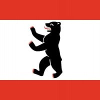 Berlin is the capital and largest city of Germany by both area and population. Its 3.8 million inhabitants make it the European Union's most populous city, according to population within city limits One of Germany's sixteen constituent states, Berlin is surrounded by the State of Brandenburg and contiguous... read more
 In a group of mostly underwhelming and boring flags this was an easy top pick for me. A lot of flags are super simple to the point they are extremly boring but this one puts a little more effort. It's the lebanese flag, but instead of a pine tree, there is a panther walking on two legs there instead. It looks nice but the main thing that catches my interests is the red colour. I like it a lot. This flag isn't amazing or anything but it's pretty good to great if I do say so myself.
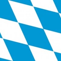
Bavaria (or Bayern), pherhaps Germany's most famous state. It's largest state, second most populated, has the highest peak, home to a lot of german stereotypes (not negative by the way), and is a southern state of Germany. This is also personally one of my favourite states of Germany because of the southern and mountainous terrain that I love. If I'd have to live in Germany this state would be my second choice (we'll talk more about my first choice later in this list). The flag certainly is no disappointment either. Well depends on what flag you mean. There are two official flags. The striped one, which is just a white and blue stripe, and the lozenge one which has a lozenge pattern of the same colours. Lozenge for the win. It juts looks so unique and nice with that colour combination and stuff.
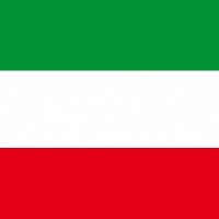
Take the hungarian flag and flip it upside down. That is the flag of North Rhine-Westphalia, a western state of Germany bordering Belgium and Netherlands. The hungarian flag was already one of my favourite flags of all time so this ain't bad either. Slightly worse though because the green colour was nerfed and I prefer having red at the top and green at the bottom instead of vice versa. Still good flag.
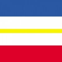
Here is a northern state. Here you have the general plains biome and stuff and a coastal climate. Also one of the six former East Germany states. The flag is pretty cool I'd say. It resembles the crimean flag but with a thin yellow stripe in the middle. Pretty nice and unique.
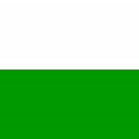
This is an example of a really simple flag but still looks cool because of good color combination and stuff. It's just the polish flag, except green instead of red. The green colour though looks great. If it'd been the same green as say in North Rhine-Westphalia's flag it'd been a lot worse in my personal opinion.
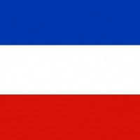
Now this is definitely the same flag as the former country of "Serbia & Montenegro", despite being located on the opposite location of Europe. I mean it's right underneath Denmark. A horizontal flag consisting of blue, white and red. The only difference is this flag is less wide. But you know I'm a fan of these types of flags so this gets points from me as well.
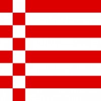
This is a city state along with Hamburg and Berlin although way smaller and actually divided between two parts located in Lower Saxony: Bremen and Bremenhaven. I've heard they are like the sailing capitals of Germany. Their flag is certainly a unique one and different from the rest. Basically it's eight stripes, red and white, but to the left, some of the lines are divided in squares and switch rows (yeah I'm not doing a good job at explaining so better wait until I add pics). Point is, it looks very original and different from the rest.
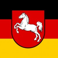
Well this will be easy. It's the german flag, but with Lower Saxony's emblem in the middle. Man that was way easier than explaining Bremen's flag. Either way, I'm a huge fan of the german flag because of its originality and colours, I mean that gold is nice certainly. While these types of flags are highly unoriginal, at least the emblem of a white horse on a red shield looks very nice. So this is a decent flag for me as well.

Here's the other bavarian flag. This one's more simple and just consists of two horizontal stripes, white and light-blue. Basically San Marino's flag if you exclude the emblem. Simple but I like the colour combination and it looks pretty cool so yeah both bavarian flags make it the top ten.
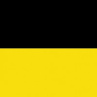
This is my dream state in Germany. My dream country is Switzerland and this is basically a replica of it. It's rich, it's mountanous, awesome terrains, you name it. Dream place in Germany. It's another southern state, but it's west while Bavaria is east. I'd love to live in that black forest mountain chain down there. Looks just amazing. Unfortunately the flag is rather disappointing. Two stripes, gold and black. Not terrible, I mean it looks alright nevertheless but it's not that good. Decent flag nevertheless.

This is a unique one certainly. Hamburg is a unique take on flags definitely. It's a white castle on a red background. It's not lower on the list because that's all it has offering though. It's a pretty cool flag though I must say.
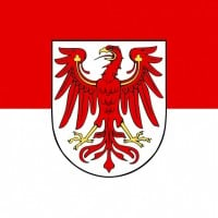 Situated in northeastern Germany, Brandenburg is both a city and a state that surrounds but does not include Berlin. The area has numerous lakes, rivers, and forests, making it a popular destination for outdoor activities. It is historically significant for its medieval architecture, including the 12th-century... read more
 Personally I do think Germany probably had trouble designing their state flags considering their originality is not much often. In fact it seems to have gotten so badly two state flags looked entirely the same: Brandenburg and Hesse. Basically, the indonesian flag. Literally. So Brandenburg added their emblem on it so it would distinguish from Hesse. And it definitely looks better. I like indonesia's flag but for some reason don't like Hesse's for some reason. Either way this is a decent flag overall.
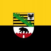
This is a yellow and black stripe flag horizontally. This is not a good colour combination and looks weird just. There is an emblem in the middle that makes it looks alright but it's still one of the bottom five flags in my opinion. I just don't like this flag all that much that's all really.
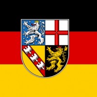
There's not much to say about this one that wasn't already said in Lower Saxony. It uses the same concept of using the german flag and then an emblem in it. This flag looks a lot less appealing though although the emblem still looks decent so it'll stay here.
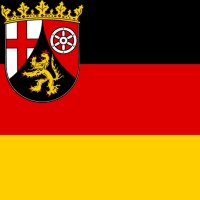
This flag is just lame and unoriginal. Oh hey, let's put the german flag and then just a little emblem in the top left corner. That surely will make me like the flag. Wrong! This flag is just lazily made. It's the third one on the list to use this gimmick but this looks just bland and boring. Saarland and Lower Saxony looked a bit better due to their emblems being in the middle of the flag and not top left and they looked better as well.
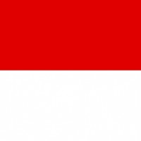
This is Indonesia's flag. Also known as the flag of Hesse. It's the exact same thing. Even the specific red colour is same in both flags. Actually wait the red is slightly darker in Hesse's flag. Still it just looks so unoriginal and lame. Could they not come up with something better? Overall one of my least favourites.
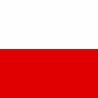
This flag is just..., boring, that's all I really have to say about this one. It's just one white stripe at the top and at the bottom is a red stripe. It looks awfully similar to Poland's flag but worse honestly. The proportions and the specific red colour made that flag pretty nice looking while this one just looks way, way too wide. The red is the same as in Switzerland's and it really doesn't fit honestly. It just looks bad instead. So yeah this flag is weakest in my opinion.