Top 10 Companies with the Most Boring Logos
-
Facebook

Facebook is an online social networking service owned by Meta Platforms, which is headquartered in Menlo Park, California. The platform allows users to interact by commenting on posts, using the Marketplace, sharing photos, making video calls, watching short clips, dating, and playing games within the... read more
I swear you could make the Facebook logo in 2 minutes using Photoshop.
I never liked this logo. It doesn't look interesting.
-
Fiat

Fiat is an Italian automobile manufacturer that was founded in 1899. It is now part of the multinational automotive group Stellantis.
Fiat produces a variety of vehicles, including small city cars and commercial models. The company focuses on offering affordable, efficient, and stylish vehicles... read more
They've been changing the logo over the years, and it's never been interesting.
-
McDonald's
McDonald's is an American fast food company, founded in 1940 as a restaurant operated by Richard and Maurice McDonald in San Bernardino, California, United States. They rechristened their business as a hamburger stand.
The first time a McDonald's franchise used the Golden Arches logo was in 1953... read more
Even changing that disgusting yellow won't save it.
All it is is a giant yellow "M." No more, no less.
Really simple and random logo.
-
Gap
-
Texaco
In my area, there's a '50s-'60s vintage Texaco sign, which is lovely. Too bad they changed it.
-
Stella Artois
-
Napster

Don't call me outdated for adding this. It was always a boring logo.
-
ADT

ADT is a provider of security and automation solutions for homes and businesses in the United States. The company is headquartered in Boca Raton, Florida, and employed approximately 12,800 people in 2024.
ADT was founded in 1874 as American District Telegraph and initially provided customers with... read more
-
Bing

-
Prada
-
?
Diet Coke
-
?
Taco Bell
Taco Bell is an American chain of fast food restaurants based in Irvine, California, and a subsidiary of Yum! Brands, Inc. The restaurants serve a variety of Tex-Mex foods, including tacos, burritos, quesadillas, nachos, novelty and specialty items, and various value menu offerings. As of 2024, Taco... read more
-
Nike
Nike, Inc. is an American multinational corporation that designs, develops, manufactures, and markets footwear, apparel, equipment, accessories, and services worldwide. The company is headquartered near Beaverton, Oregon, in the Portland metropolitan area. It is the world's largest supplier of athletic... read more
Fun fact: The founder of Nike paid the creator of the logo $35 for it in 1971.
-
Los Angeles Lakers
The Los Angeles Lakers are a professional basketball team based in Los Angeles, California. They are a member of the Western Conference Pacific Division of the National Basketball Association. As of the 2024-2025 season, the team plays its home games at the Crypto.com Arena.... read more
-
Hollister
-
Microsoft

Microsoft Corporation is an American multinational technology company headquartered in Redmond, Washington, that develops, manufactures, licenses, supports, and sells computer software, consumer electronics, personal computers, and services. It was founded by Bill Gates and Paul Allen on April 4, 1975... read more
-
Instagram

-
BP (Old)
-
CVS Pharmacy

To me, it just looks unprofessional.
-
Ford
The Ford Motor Company is an American multinational automaker headquartered in Dearborn, Michigan, a suburb of Detroit. It was founded by Henry Ford and incorporated on June 16, 1903, and it pioneered assembly-line manufacturing for mass production. Its product portfolio includes the Ford and Lincoln... read more
-
Pepsi
PepsiCo Inc. is an American multinational food, snack, and beverage corporation headquartered in Purchase, New York. The company is involved in the manufacturing, marketing, and distribution of grain-based snack foods, beverages, and other products. It is one of the largest food and beverage companies... read more
-
NASA
The National Aeronautics and Space Administration (NASA) is the United States federal agency responsible for the civilian space program as well as aeronautics and aerospace research. It was established by the National Aeronautics and Space Act on July 29, 1958, and began operations on October 1, 1958... read more
-
Nickelodeon
-
Golden State Warriors
The Golden State Warriors are an American professional basketball team based in San Francisco. The Warriors compete in the National Basketball Association as a member of the league's Western Conference Pacific Division... read more
-
Build-A-Bear Workshop
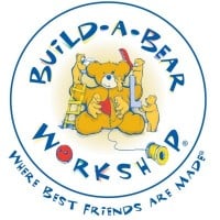
Their old logo, as shown in the image above, was fantastic. However, after Sharon Price John took over, the logo turned into the most boring "modern, minimalist" piece of junk out there. It is definitely not one that will capture the attention of children. I am convinced that Sharon ruins everything she touches.
-
Erie Lackawanna Railway