Top 10 Hidden Images in Logos of Famous Brands
When you start a brand today, one of the first things you need is a logo. It's more than just a symbol or a name, it's a way to tell people what you're about at a glance. A good logo is simple, recognizable, and often carries a deeper meaning. Some companies take this to the next level by hiding clever images or messages in their designs.
You've probably seen some of these logos hundreds, if not thousands, of times without noticing the little details tucked inside. Maybe it's an arrow hidden between letters, a word disguised in a design, or a subtle nod to the company's history. These aren't just random artistic choices, they're intentional, and once you see them, you can't unsee them.
-
Smile and "A to Z" - Amazon

You know, I think just about every adult has been on Amazon before, and it's pretty obvious why. It is the most popular online shopping app in the world. Have you ever had a thought where Amazon is smiling at you? Well, it actually is. The first iteration of the logo was in 2000, around the time Amazon went from just selling books to just about anything.
If you look closely at the logo, you can see a happy demeanor that is smiling and showing the positivity that comes with shopping on their website. Another cool thing is the A and Z involved in it. Since the arrow points from those two letters, it shows that Amazon sells anything from A to Z.
-
The word "Toyota" in the logo - Toyota
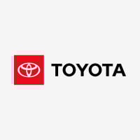
Let's go places, as people would say. In 1989, the popular vehicle brand Toyota unveiled its new logo by putting it on the front of the Celsior, a luxury model vehicle, and it ended up getting positive feedback. What you might see in the logo is actually pretty insane. It actually spells out the word Toyota. You can try it for yourself because it spells all six letters of the word.
Another cool thing, claimed by Toyota, is that the two ovals in the middle represent the heart of the company and the customer, revealing the mutual and trusting relationship they have.
-
The hidden arrow - FedEx
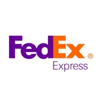
FedEx is known for being a multinational delivery services company that delivers packages to people who order items. Although the logo is very popular, it has a hidden message. If you look between the 'e' and 'x', you'll see a white arrow. This is meant to imply that FedEx is always on the move. In May 2003, during their 35th anniversary, The Rolling Stones ranked it as one of the eight best logos from the previous 35 years.
And there's a spoon inside the "E" as well.
-
"Mom" in the collar - Wendy's
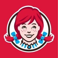
Wendy's is a popular fast-food restaurant that was first opened by Dave Thomas in November 1969 and has been going strong ever since. While the food they serve has changed significantly over the years, one thing that hasn't is the hidden image in their logo. To be honest, I don't know the history of the logo, but that doesn't matter to me.
When you take a close look at their 2013 redesign, you can see that the collar around her neck forms something that looks like the word mom. Who knows? Maybe someday there will be a kid named Scott who opens his own restaurant and incorporates the word dad into the logo.
-
"31" in the logo - Baskin-Robbins
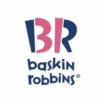
Founded in Glendale, California, in 1945, Baskin Robbins is a chain of ice cream and cake specialty shops. It was created when Burt Baskin and Irv Robbins merged their parlors into one. The company promises customers that they can enjoy a different ice cream flavor every day of the month. Interestingly, in the logo, you can make out the number 31 in pink. Additionally, if I remember correctly, there is also a 12 in it to represent the number of months in a year.
-
People enjoying the brand - Tostitos
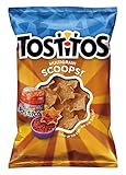
Here's a tip of advice: If you ever want to advertise your product in a smart way, show people enjoying it (not my words). That's pretty much what Tostitos did. Even though many people appear in media or in TV commercials, Tostitos did it right in their logo.
In 2003, Tostitos decided to upgrade their product's logo. While working on the colors, they added a hidden image. If you look between the two T's, you'll see what appear to be human heads. The I in the middle has a red, circle-ish shape representing salsa. Finally, the T's are both holding a chip and dipping it into the salsa. Crazy, right?
Famous for their tortilla chips and accompanying dips, Tostitos has perhaps one of the best hidden logo messages of all time. The two lowercase t's in the logo represent people holding a chip, and the dot on top of the letter i serves as their bowl of salsa.
-
The bear in the mountain - Toblerone
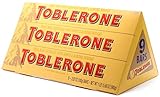
In 1908 in Switzerland, two people named Theodor Tobler and Emil Baumann created Toblerone, a chocolate candy known for its unique taste and triangular shape. The candy is especially popular during the holidays. Bern, the city where Toblerone was created, has had a seal featuring a bear climbing upwards since 1220. The founders wanted to honor this by incorporating a bear into the logo.
It might be a little hard to make out, but if you look closely, you can see the silhouette of a bear climbing up the mountain.
-
"LG" in the winking face - LG
Most people can almost immediately recognize the winking face logo of the phone company LG. However, if you look at the logo with a discerning eye, you'll notice that the company's iconic winking face is actually composed of an 'L' (making up the nose) and a 'G' (making up the shape of the face).
-
The pin shape in the "P" - Pinterest
Once upon a time in August 2008, three men joined an application company called Cold Brew Labs. After their first product, Tote, failed, they decided to create Pinterest, a company that serves as a catalog of ideas. In the logo, you can easily make out a P, but what you might not have known is that the P closely resembles a pin. Although some people might think it's a bit on the nose, the more they looked at the logo, the more they saw a map pin in the P.
I feel dumb for not noticing it before.
-
Sine wave signal and binary reference - Vaio
Vaio is known as one of Sony's most respected brands. It was launched in 1996 and has since impressed people with its vision for computers. Although the brand was eventually sold to Japan Industrial Partners, the firm chose to keep the logo because of its uniqueness.
Designed by Timothy Hanley, you might think at first glance that it's simply a creative way to spell out Vaio. However, if you look more closely, you'll see that the V and A form a replica of a sine wave signal, which represents analog, while the I and O resemble a 1 and a 0, which are meant to represent binary code.
-
?
The peacock in the logo - NBC
-
?
Smiling "g" - Goodwill Industries
-
Headphones in the letter "B" - Beats by Dre
This one is pretty darn creative.
-
Kiss shape in the logo - Hershey's Kisses
This one might be a little tough since you'll need to tilt your head to see it. At least, that's the best way. First produced in 1907, Hershey's Kisses were made by the same company that produced the Hershey Bar. (The connection is a little obvious from the title.) People got the idea for Hershey's Kisses from what is believed to be the sound made when milk chocolate was dropped.
In the logo, you can see that the space between the 'K' and the 'I' in Kisses has what appears to be the shape of an unwrapped Hershey's Kiss. Now, if only there were a way to take it out and get free candy.