Top 10 Worst Company Mascots Ever
Company mascots are meant to be the friendly, recognizable faces of a brand, characters that make you smile or at least remember the product they're hawking. But sometimes, things don't go as planned.
Some mascots end up being more confusing than charming, or worse, downright creepy. Whether it's a misguided concept, poor design, or just something that doesn't click with audiences, not every mascot can be a winner.
-
Jack Box (Jack in the Box)
-
Spongmonkeys (Quiznos)

I agree, as these were already the main reason I stopped going to Quiznos. What's worse is that Subway isn't safe either! I actually used to think Subway was better than Quiznos, but then I learned the darker truth about their mascot/spokesman, Jared Fogle, who turned out to be a pedophile. No wonder I prefer Firehouse Subs now.
Looks like a drug addict created this thing. I can't tell if it's supposed to be a person, an animal, or a potato with eyes and lips, and then a preschooler finished the final touches on the design.
-
Subman (Subway)
-
Happy Star (Carl's Jr.)
-
The Noid (Domino's)

-
Wendy (Wendy's)
-
Burger King (Burger King)
-
Arby's Oven Mitt (Arby's)
-
Ronald McDonald (McDonald's)
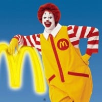
Ronald McDonald is a clown character used as the primary mascot of the McDonald's fast-food restaurant chain. He was first introduced in the 1960s. Ronald has appeared in various commercials, promotions, and the Ronald McDonald House Charities campaign.
-
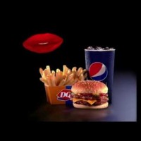
DQ Lips (Dairy Queen)
-
?
Reddit Alien (Reddit)

-
?
Nakadasshi (Nakadashi Gakuen)
He would have been fine if he wasn't broken.
-
Proto (Protogent)

Bad recolor/rip-off of Super Why.
Lol. That is literally orange Super Why.
-
The Kinder Egg Man (Kinder)
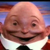
I didn't plan on sleeping anyway.
He sucks for being so creepy.
-
Chuck E. Cheese (Chuck E. Cheese's)

Especially the older, creepier versions.
OMG, that picture! What?!
-
Lemonhead (Ferrara Candy Company)

-
California Raisins (Sun-Maid)
-
Little Baby's Ice Cream Person (Little Baby's Ice Cream)
By the way, his name is Malcolm.
-
Progressive Box (Progressive)
The Progressive Box should be in the top 3 because it's so creepy and annoying.
-
Crazy Craving (AKA Craver) (Honeycomb)
-
Happy the Happy Meal (McDonald's)
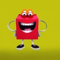
To be fair, he should be ranked above Ronald McDonald.
-
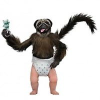
Puppy Monkey Baby (Mountain Dew)
-
Erin Esurance (Esurance)

Erin Esurance is a fictional character created as the animated mascot for the auto insurance company Esurance. She is depicted as a tech-savvy, pink-haired secret agent who uses high-tech tools to promote fast and easy insurance services. The character was designed to appeal to younger, digitally oriented... read more
She looks like a rip-off of Black Widow.
Bootleg Kim Possible.
-
Pepsiman (Pepsi)

-
K.C. Penguin (Kid Cuisine)
-
Mr. Clean (Procter & Gamble)
I hate Mr. Clean. He looks like a grown-up version of Caillou.
-
The Gobbledok (Smith's Chips)