Top Ten Netherlands Province Flags
I've done lists for the flags of the states of Brazil, and states of Germany. Now I'm moving onto the provinces of the netherlands. With that being said here is the list.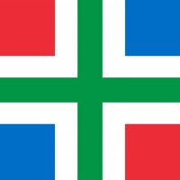
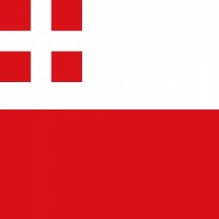
Groningen has without a doubt the best flag of all the Netherlands province flags. Hands down one of the most colourful flags there is right up there with The Gambia and South Africa. It basically looks like the dominican republic flag but with reversed colours, and instead of an emblem, a green cross is in the middle. This looks just so amazing! I love how colourful it is and therefore it is my favourite netherlands province flag.
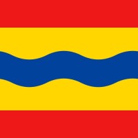
This flag looks just amazing! Kinda like the thai flag as the bottom and upper stripe is red (but brighter) and the middle stripe is blue (but brighter, and wavier as well). However the white is replaced with gold. It looks amazing with the wavy blue and golden surrounding it. It just looks so well?
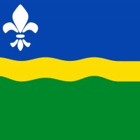
Blue yellow and green colours more or less make up for great colour combinations on flags. Gabon, Tanzania and Solomon Islands are fine examples, and Flevoland right here is no exception. The top stripe is blue, the bottom thick stripe is green and in the middle is a thin yellow stripe that's a bit wavy, along with a white emblem to the top left. It looks very good personally and it's one of the top choices for me.
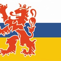
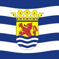
Limburg (technically Dutch Limburg as there is one in Belgium as well) is probably the most majestic looking of the flags. The colour combination is nice with the thick white and yellow horizontal lines and the thin blue in the middle, combined with the majestic red lion on the left. Definitely one of the best flags.
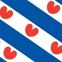
Friesland, the land of the frisian people. Fun fact, the frisian language is the language most closely related to english (even though it sounds nothing like it). Friesland is the province located on the northwestern coast and has a very incredible flag with the blue and white diagonal stripes and red hearts in the white ones. It looks very unique if I do say so myself.
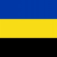
This is generally basic flag with a dark blue gold and black horizontal flag. It looks definitely nice with the dark colours and fitting combination. Overall this is the sixth best flag in my opinion when it comes to the provinces of the Netherlands.
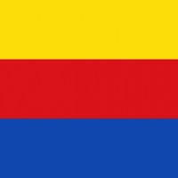
This is another basic one but it looks very good and nice nevertheless like Gelderland. It's simply a horizontal yellow red blue flag and I like it overall although it'd been better if the colours had been reversed personally. This combination looks very sporty and while I dislike sports it looks good nevertheless. Gelderland is slightly better though because of the colours.
Not one of the top tier flags but a pretty nice flag to say the least. I definitely like the ocean theme of it with the wavy blue and white horizontal lines. That definitely reminds me of the sea. The emblem in the middle helps it be better as well. So despite being low it's still great.
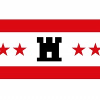
This is certainly a nice looking. I like the white background with red lines surrounding the middle white line that contains six red stars and a castle. It looks great definitely although I wish it was slightly more colourful but that's the only complaint.
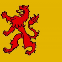
The flag features a red lion rampant facing left on a yellow field. The lion covers three-fourths of the flag's height, and is positioned on one-thirds of the flag's width.
It’s a pretty basic looking, but still deserves a mention on this list. This flag looked different in the past with yellow on the top, red in the middle and yellow on the bottom. In 1986, they decided to change the flag by adding the lion and making the rest of the flag yellow.
The red lion to the left on a yellow banner is surely a pretty nice one. Even though only my 11th favourite out of the 12 flags, I still really like it a lot if I do say so myself. I do think I slightly prefer north holland's flag though because of the pattern
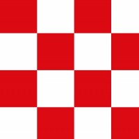
It's simply a red and white checker pattern. Nothing too interesting but it certainly looks nice I'll give it that. There are four times six squares and they're white and red. It's pretty cool looking I'll give it that.