Best U.S. State Flags
 Maryland is a state located in the Mid-Atlantic region of the United States, bordering Virginia, West Virginia, Pennsylvania, Delaware, and Washington, D.C.
 This flag is just crap. I don't know why the hell people are praising this waste of cloth. The people (especially in Maryland) worship this flag more than the Ukrainians worship war criminals.
My life began in Maryland, very proud of this states flag. Even though I don't live there I'm still proud of the beauty and design of this flag. Always thought it was unique, the colors and the history of the states all brought together, and it made me proud to display my hometown flag at the different Army post I've lived at. Oh, and to be sure, it makes a pretty neat looking bow tie too.
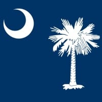 South Carolina is a state in the southeastern region of the United States. The state is bordered to the north by North Carolina, to the south and west by Georgia across the Savannah River, and to the east by the Atlantic Ocean.
 This flag unlike most of the other state flags actually shows something that South Carolina is well known for being! This flag is in my top 10. (It's literally nicknamed "The Palmetto State.") I wish more states would make their flag have an image of something their state is well known for.
For those who think this is a palm tree, it is not. This is a PALMETTO tree (this the nickname The Palmetto State) and they are native to our state. The wood of the tree is very soft and makes for good defensive structures because it absorbs cannon shot instead of shattering. This is the simplest and most aesthetically pleasing flag of all.
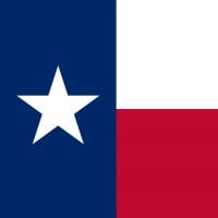 Texas is a state in the Southern USA. It is the second largest by area and population. Its largest city is Houston.
 Texas's flag is the best! Out of all the flags here, this flag is the most American. It's only colors are red, white, and blue! And finally, it has a star on it that represents the state. It might not be the American flag, but it is the best and most American flag of all 50 us states!
There is a lot of history behind this flag. We were our own country for a decade before becoming a state. No other states can say that.
They stole it from Chile!,30 years after Chile's flag. Chile's flag is known as "La Estrella Solitaria" (The Long Star). Another Texas name.
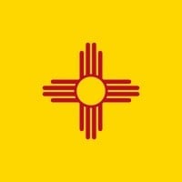
I'm a Air Force brat and have personally seen a lot of flags, Both from the U. S and other countries as well. I've lived in New Mexico for 22 years and I feel the New Mexico flag is beautiful, unique and awesome and I'm glad it made #2 even though it should be #1! Most people think New Mexico is a whole different country, but of course it's the 38th state as of 1912. Americans need to know we are a STATE! Haven't they heard of Billy the kid' Smokey the Bear or even the Manhattan project! Haven't they seen the old footage of the mushroom cloud from the first A bomb tested at Whitesands trinity site. Its only in a heck of a lot of movies! Any way New Mexico ROCKS and we have one of the best flags in the world!
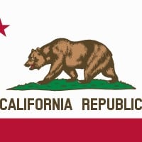 California is a state in the Southwestern United States. With 39.6 million residents across a total area of about 163,696 square miles (423,970 square kilometers), California is the most populous U.S. state and the third-largest by area. The state capital is Sacramento, and the largest city is Los Angeles... read more
 The California flag is awesome! It has a cool bear on it and it has a lot of color! I especially like that it says "California" on it so you don't have to guess what state it is! I was surprised that California was so low on the list though... Oklahoma has a really cool flag too!
Very detailed and impressive, nice to represent the state and a good symbol overall. I like the style of the flag and just the general presence of it. Noting that it says California Republic, making no confusing of which state it is (I am looking at you, Hawaii).
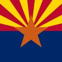 Arizona is a U.S. state in the southwestern region of the United States. It is also part of the Western and the Mountain states.
 Many state flags are simply an existing seal slapped onto a monochrome background. Arizona's flag is technically simpler than many, but contains far more depth.
The stripes emanating from the star represent both the climate of the state and the Spanish legacy. Their number also ties back to the thirteen original states. The star's copper color reflects its history in mining as well as standing out from the other colors. The blue bottom of the flag represents the Colorado River, a dominant geographic feature, and also serves as a counterpart to the warm colors emanating from the star.
What you end up with is a flag with only four colors, simple to draw from memory and recognize from a distance, but also one impossible to disconnect from the state it represents.
 Ohio is a state in the midwestern region of the United States. Ohio is the 34th largest by area, the 7th most populous, and the 10th most densely populated of the 50 United States.
 Ohio is the only U.S. state flag that isn't rectangular. Also, it has a lot of symbolism in it. The stars that are on the left side of the flag represent the original 13 colonies, as there are 13 stars. The 4 stars to the right, when added to the other 13 stars makes 17 because Ohio is the 17th state. The red and white circle on the flag is to make the O in Ohio (I have also heard that the O in the flag represents a buckeye, but that one may not be true). Finally, because of the way the flag is shaped, it is folded 17 times, as again, it is the 17th state. Ohio's flag is very unique and has a lot more symbolism in its flag than most of the other flags on this list.
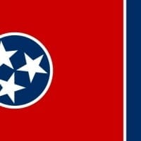 Tennessee is a state located in the southeastern United States. Tennessee is the 36th largest and the 17th most populous of the 50 United States.
 Easily recognizable then flying or hanging. Simple and well conceived.
Great colors and a nice design.
 Pennsylvania, officially the Commonwealth of Pennsylvania, is a state located in the northern and Mid-Atlantic regions of the United States.
 The most incredible flag ever. it should be in the top 3, not no.9, and what is with the found dates take them off and we will have 49 perfect flags (not Illinois)
Yeah might not be number one, but still pretty cool. Some look so poorly drawn (Illinois), and why do some have their found dates, that doesn't belong on a flag. Also I agree it so underrated.
The most underrated flag. The colors and designs together create perfection. Of the older state flags that are similar, this one is the best.
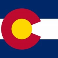 Colorado is a state in the United States encompassing most of the Southern Rocky Mountains as well as the northeastern portion of the Colorado Plateau and the western edge of the Great Plains.
 The flag is plain, simple and frank; just the way a flag should be. Colorado will be the best state, besides, Denver has the highest quality of life in the US.
I like it! Anyways, the C is red for the Earth, the golden disc for the sun, the blue stripes for the sky, and the white for the snowy mountains.
Simple and distinct, you see this design everywhere in the state. Everyone wants to wear it or have some article of clothing with it.
 Alaska is a U.S. state situated in the northwest extremity of the Americas. The Canadian administrative divisions of British Columbia and Yukon border the state to the east; it has a maritime border with Russia to the west across the Bering Strait.
 Good looking flag. Like the stars. 8/10
The Great Dipper and North Star represent the strength and northern orientation of Alaska
Stars with a dark blue background there is something about this flag that amazes me

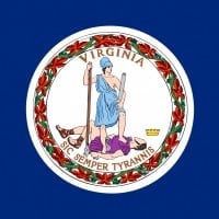 Virginia, officially the Commonwealth of Virginia, is a state located in the South Atlantic region of the United States.
 By accident, I put Virginia a second time.
Simple and classic. Also kind of badass
Its cool and unique, in a gladiator way.

If it didn't have its name on it (small I admit), and a brighter yellow and different design this would've been a perfect flag! As it is now though, it's a good 7.8/10 (by the way I'm biased since I live here)
I agree, the name is not necessary. The design came from a contest sponsored by the Daughters of the American Revolution. Paul Hadley of Mooresville won the contest without having the name on it. The General Assembly added it.
Indiana's flag is really good, and would be even better without the name. For sure one of the best.
 Alabama is a state located in the southeastern region of the United States. It is bordered by Tennessee to the north, Georgia to the east, Florida and the Gulf of Mexico to the south, and Mississippi to the west.
 What? This is the Norther Ireland Flag copied - Niall Ashraf, flag enthusiast
 Mississippi is a southern U.S. state with the Mississippi River to its west, the state of Alabama to its east, and the Gulf of Mexico to the south.
 Mississippi, I'm so glad you changed your flag. Utah also did this, but you started states redesigning their flags. I love the flag as well, 8.98/10
This is my home state and the people of Mississippi (white and black) like their state flag. The rabble-rousing around the nation over the Rebel flag is a media launched campaign attempting to capitalize on a tragedy to advance a political cause. Those advocating it should be ashamed of themselves.
Beautifully simple, includes civil war history (begin the race flame-out in one...two...thr) I like the civil war aspects maybe because Mississippi black voted overwhelmingly to keep it. And with our current history purge it's nice to see. As they said in the USSR " the future is secure it's the past that keeps on changing"
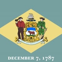 Delaware is one of the Mid-Atlantic states located in the Northeast megalopolis region of the United States.
 First state right? Or am I wrong well I'm saying it's the first state so if I'm wrong I'm going to pretend I never got a reply
Woo hoo! We're #11! I can honestly think of some below us that shouldn't be.
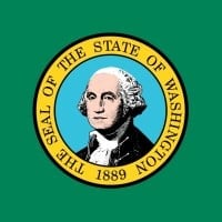 Washington is a state in the Pacific Northwest region of the United States located north of Oregon, west of Idaho, and south of the Canadian province of British Columbia on the coast of the Pacific Ocean. It is the only state named after a president.
 Easily identifiable when flying without having to read some funky emblem on a blue background.
It's the only green flag, and is pretty basic and well designed.
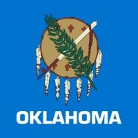
My grandmother designed this flag. I don't think she approved of the addition of "Oklahoma". It looked much nicer without. It's the best in my book!
If you've never seen the Oklahoma flag, take this time. Check it out and tell me it's not the coolest.
Would look better and be a cool flag without "Oklahoma" in there.
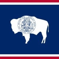 Wyoming is a state in the mountain region of the Western United States. The state is the tenth largest by area, but the least populous and the second least densely populated of the 50 United States.
 Yup, easily recognizable when flying. Maybe not so much when hanging but at least it's not a big round seal in the middle of a blue field like far too many others.
It looks like the louisiana flag but a buffalo instead of a pelican
The bison represents the fauna, while the seal symbolizes the custom of branding
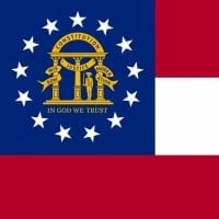 Georgia is a state located in the southeastern United States. It was established in 1732, the last of the original Thirteen Colonies.
 Restrained and elegant, incorporates state history but doesn't offend.
This is just the confederate flag with the seal of Georgia in it.
If you are a southerner and know your history and also do not want to offend anyone, you will LOVE this flag
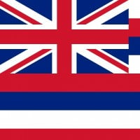 Hawaii is the 50th and most recent state of the United States of America, receiving statehood on August 21, 1959.
 By far the least creative, and maybe even worst flag in America, EVER. A lot of people forgot Hawaii's past, so Hawaii may be sued one day.
A beautiful flag, but completely out of character with the state it represents. Why isn't it green and pink?
American State. Supporter of the Queen. Great combination.
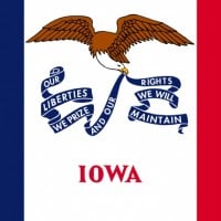 Iowa is a U.S. state in the Midwestern United States, bordered by the Mississippi River on the east and the Missouri River and the Big Sioux River on the west.
Iowa is a strong Republican state with Constitutional Carry. Masks have never been mandatory and Iowa was never locked down.
Iowa is a U.S. state in the Midwestern United States, bordered by the Mississippi River on the east and the Missouri River and the Big Sioux River on the west.
Iowa is a strong Republican state with Constitutional Carry. Masks have never been mandatory and Iowa was never locked down. Its clean and not bland with a message on the ribbon. I would much rather have this flag the colorado one or the california flag over the national flag.
I love both the state and the flag. It gives me a sense of both patriotism and liberty.
 Utah is a state in the western United States. It became the 45th state admitted to the Union on January 4, 1896. Utah is the 13th-largest, the 31st-most populous, and the 10th-least-densely populated of the 50 United States.
 A bald eagle symbolizes war. The sego lily represents peace. The beehive represents hard work. The date 1847 represents the year the Mormon pioneers entered Salt Lake.
I feel sad for Utah, it was the #5 worst state flag for Thanksgiving 2013.
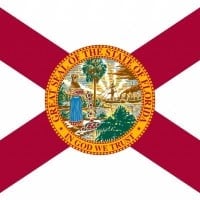 Florida is a state located in the southeastern region of the United States. Florida is the southeasternmost U.S. state, with the Atlantic on one side and the Gulf of Mexico on the other.
 A beautiful state with a great culture and history, however, its flag is one of the most least attractive of the state flags. They should make it zigzag to look similar to the Spanish flag of the 1700s.