Worst Designed Gen 3 Pokemon
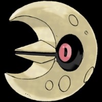
Gen 3 is where some designs became highly controversial among many fans of the series due to more detailed designs of many Pokemon and the general absurdity of some of them increasing greatly. This created many bad looking Pokemon among those that looked great.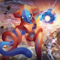 Deoxys, known in Japan as the same name, is a Legendary Pokémon species in Nintendo and Game Freak's Pokémon franchise.
 It just looks so creepy to look at. Some kids may have had nightmares about this.
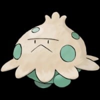
It's just a mushroom with an unpleasant face and stumpy legs, not very creative, despite evolving (somehow) into a kangaroo-like mushroom (which is very creative in comparison with this mushroom).
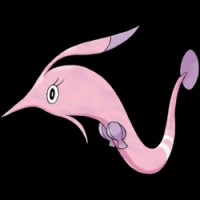
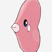 Luvdisc, known in Japan as Lovecus, is a Pokémon species in Nintendo and Game Freak's Pokémon franchise.
 This pokemon is understandably hated by a large portion of the fanbase due to how boring everything about it is, with one of the most uninspired designs in all of pokemon.
How is this hideous? I think it looks cute. But other than that, it's just badly designed since it is just a heart with a fish head on it.
Excellent to use as a battering ram though
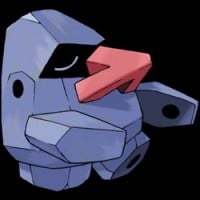 Nosepass, known in Japan as the same name, is a Pokémon species in Nintendo and Game Freak's Pokémon franchise.
 Gen 3 has the best designs. My favorite generation and it is sometimes known as the black sheep, basically completley changing the game. Most designs like aggrons are badass but this and luvdisc is a big fat NOPE.
This one just looks plain ugly, but isn't even ridiculous enough to be funny like Probopass is, making it look stupid, just not stupid enough.
While gen 1 had 2 distinct cocoon pokemon that both looked somewhat interesting and defined themselves from each other, this is not the case here, as both Silcoon and Cascoon look extremely similar and unappealing
Nearly identical to Silcoon, just with a slightly nicer color palette and with better eyes.
 Swalot, known in Japan as Marunoom, is a Pokémon species in Nintendo and Game Freak's Pokémon franchise.
 It looks extremely similar to Grimer, which everybody hated. The reason I like it more than Grimer is just because of the funny looking mustache that it has.

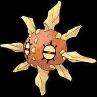
Very plain with the lower half of its body looking very questionable. Even when the weather changes, it still isn't that interesting.
This Pokemon looks too inappropriate for younger audiences to watch.
It has big boobs
This is an extremely bizarre looking pokemon, and I'm not a big fan of it. The way it has no mouth and its face all slopes into one point make it look unsettling, which I don't think was the intention.
Some really bad coloration combined with an awkwardly designed face makes Huntail another pokemon that just doesn't look good at all.
Shiny Huntail look better.
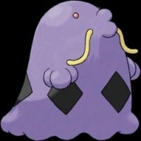
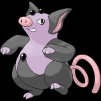 Grumpig, known in Japan as Boopig, is a Pokémon species in Nintendo and Game Freak's Pokémon franchise.
 It doesn't look as bad as Stanlers because Grumpigs look more unique compared with regular pigs. It is Stantlers that should be on the worst designed Pokemon list because they look too similar to real life deer.
Just like with me not liking Stantler because it's a deer, Grumpig is just a purple and black pig.
It's kind of ugly, and the dance sure doesn't help.
It looks very washed out without any kind of interesting design aspect about it, making it an extremely unremarkable pokemon.
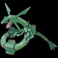 Rayquaza (pronounced "ray-quay-zah") is a Dragon/Flying type Legendary Pokémon species in Nintendo and Game Freak's Pokémon franchise. It serves as the mascot in the game Pokémon Emerald. Rayquaza can mega evolve into Mega Rayquaza provided that it does not have a Z-Crystal and it knows the move "Dragon Ascent". According to the Pokédex, it lives in the ozone layer, and frequently stops battles... read more
 How is this design bad? What is Rayquaza doing here on this list?! It actually looks cool and very creative. It is Deoxys that should be on this list, not this, due to Deoxys looking too scary for children, especially with the Deoxys' dead-looking eyes.

Basically just a frogfish with a leaf-like appendage on its head.

This bird has a boring design since it is just a seagull.
 Whismur, known in Japan as Gonyonyo, is a Pokémon species in Nintendo and Game Freak's Pokémon franchise.