Top Ten Stupidest Logo Changes Ever
Note: by worst logo changes I mean the tiniest detail the company made to make the logo worst or no better than it already was, so don't get confused. Look them up to see the changes yourself.
The one in the picture is the newest version, sure they changed it and added some better brighter colors but they took the details out of the Fox and that what I really liked about the logo.
Old logo: I know it's a fox just by looking at it!
New logo: Um... what is this animal?
Just see for yourself it's really stupid
 Taco Bell is an American chain of fast food restaurants based out of Irvine, California and a subsidiary of Yum! Brands, Inc. The restaurants serve a variety of Tex-Mex foods that include tacos, burritos, quesadillas, nachos, novelty and specialty items, and a variety of "value menu" items. As of 2018, Taco Bell serves more than 2 billion customers each year at 7,000 restaurants, more than 80 percent of which are owned and operated by independent franchisees and licensees.
 This picture is the old one,They just removed color and detail for it how smart
Verizon compared to the old logo sucks that big read check is what makes it reconizable
all they did was change the the letter boring and normal and added the tiniest check to the side of the word BORING!
 Lenovo Group Ltd. is a Chinese multinational technology company with headquarters in Beijing, China, and Morrisville, North Carolina, United States.
 The Lenovo logo is nothing amazing but it's what made the print of the letters cool, but when they changed it and made the letters normal and put it on a red background,lame
Dang... I have a lenovo computer
THis is the logo after before it had a unique written style, but some people prefer the newer crisp looking version I don't
Yep and then they went and changed all the belts to look the same.
 Yahoo! is an American web services provider. It is headquartered in Sunnyvale, California and operated by the namesake company Yahoo Inc., which is 90% owned by investment funds managed by Apollo Global Management and 10% by Verizon Communications.
 That's the old Yahoo, they changed it the a purple on a white background, and the print is lame just old Yahoo
Check it out the star inside the O of the converse is what I liked
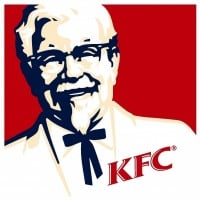 KFC, until 1991 known as Kentucky Fried Chicken, is an American fast food restaurant chain that specializes in fried chicken. Headquartered in Louisville, Kentucky, it is the world's second-largest restaurant chain (as measured by sales) after McDonald's, with almost 20,000 locations globally in 123 countries and territories as of December 2015. The chain is a subsidiary of Yum! Brands, a restaurant company that also owns the Pizza Hut and Taco Bell chains.
 This is the before picture after it change to black and white he look less old and he isn't at a slant
 The Hewlett-Packard Company was an American multinational information technology company headquartered in Palo Alto, California.
They just changed the logo to all green how clever

What you see here is the original, and far superior logo.
 Google is an American multinational technology company specializing in Internet-related services and products. These include online advertising technologies, search, cloud computing, and software.
 I miss the old logo before 2015 when the letters actually looked cool
That new box thing is not natural
 Burger King (BK) is an American global chain of hamburger fast food restaurants. Headquartered in the unincorporated area of Miami-Dade County, Florida, the company was founded in 1953 as InstaBurger King, a Jacksonville, Florida-based restaurant chain. After Insta-Burger King ran into financial difficulties ...read more.
 Fiat is an Italian automaker that was founded in 1899. Now a part of Stellantis, the company is known for producing a wide range of vehicles, from small city cars to commercial vehicles. Fiat focuses on delivering affordable, efficient, and stylish cars that cater to a broad market. The brand aims to provide value for money while maintaining a reputation for quality and reliability.
 Although the five lines next to each other were never used as an official logo, it is much more recognizable than the current FIAT script on a red background.

I liked the old camera logo better even though I don't use Instagram