Top 10 Best Color Schemes for a Family Photo
Choosing the right colors to wear can make a huge difference in how your family portraits turn out. It's important to find an ideal palette that ties everyone together without making them look overly matched or unnatural. By coordinating complementary shades, you'll allow the subjects to stand out while creating a beautiful overall aesthetic.
This list features some of the most flattering and popular color combinations for group photography. When you're voting or suggesting new ideas, consider how well these palettes work across different skin tones and body types. You'll also want to think about how these colors blend with various backgrounds, from natural outdoor landscapes to indoor studio settings.
-
Navy and Mustard Yellow

This striking combination offers a perfect balance of deep, grounding tones and bright, energetic pops of color. The dark blue provides a universally flattering base for most skin tones, while the yellow adds a cheerful warmth to the composition. It's exceptionally effective in natural settings, particularly during the autumn months when leaves are changing.
-
Earth Tones
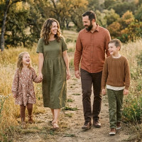
Drawing inspiration from nature, this palette utilizes olive greens, warm browns, and muted terracotta shades. These colors blend harmoniously to create a grounded, organic feel that translates beautifully on camera. They're a wonderful choice for outdoor lifestyle sessions because families choosing this scheme often look relaxed and comfortable.
-
Burgundy and Grey

Combining rich wine tones with neutral greys offers a sophisticated and elegant visual dynamic. The cool tones of the grey perfectly balance the deep warmth of the burgundy, preventing the red from overpowering the photograph. It's particularly stunning for winter portraits or formal holiday cards where families want to look a bit more dressed up.
-
Denim and Crisp White
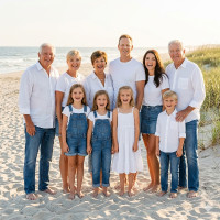
This classic combination has remained popular for decades due to its simplicity and accessibility. Almost everyone already owns these staple pieces, making wardrobe coordination incredibly easy for large groups. It's a fresh, timeless look that works exceptionally well for beach or casual backyard shoots.
-
Teal and Copper
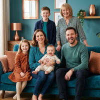
This vibrant pairing creates a dynamic visual contrast that immediately draws the eye. The rich jewel tone of the teal provides a luxurious backdrop, while the metallic warmth of the copper adds a unique textural element. It's an excellent choice for families wanting a modern, stylish look that stands out from more traditional palettes.
-
Soft Pastels

Utilizing gentle shades like blush pink, baby blue, and mint green creates a delicate and dreamy atmosphere in portraits. These light hues reflect light beautifully, which can help illuminate faces and create a soft, glowing effect. It's highly favored for spring sessions or newborn photography where a gentle aesthetic is desired.
-
Emerald Green and Gold

This luxurious combination brings a sense of regal elegance to any family portrait session. The deep green acts as a striking alternative to black or navy, while the gold accents add a touch of celebratory sparkle. It's a rich color scheme that families often utilize for formal studio portraits or festive holiday sessions.
-
All Neutrals
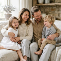
A palette consisting entirely of creams, tans, soft greys, and whites focuses all the attention squarely on the subjects' faces and expressions. By removing distracting colors, the resulting images feel incredibly timeless and airy. They're often recommended by photographers who suggest mixing different fabrics and textures within the neutral spectrum to prevent the outfits from looking flat.
-
Plum and Cream

Mixing a deep purple with a soft off-white creates a romantic and visually compelling aesthetic. The cream prevents the plum from feeling too dark or heavy, resulting in a beautifully balanced composition. It's highly versatile, looking just as appropriate in a rustic outdoor setting as it does in an urban environment.
-
Coral and Navy

This energetic pairing brings a lively and summery feel to group photographs. The brightness of the coral provides a fun, playful element, while the navy anchors the overall look with its traditional depth. It's a fantastic option for families who want their photos to exude happiness and vibrant energy.