Top 10 Most Beautiful Colors
Color hits you before logic ever gets a chance. You see it, feel it, react to it. A single shade can calm your nerves, raise your pulse, or pull you back into a memory you did not expect to revisit. You do not need an art degree to know when a color just works. Your eyes decide in a split second, and your brain follows along trying to explain why.
You already carry a personal ranking in your head. It shows up in the clothes you reach for, the way you decorate your space, even the apps and wallpapers you pick without thinking twice. Some colors feel clean and effortless. Others feel bold, loud, or impossible to ignore. And then there are those rare ones that seem to sit right in the middle, doing a little bit of everything at once without trying too hard.
This list is built around that instinct. Not rules. Not technical charts. Just the shades that keep showing up, again and again, in art, design, nature, and everyday life because people cannot get enough of them. Now it is your turn to decide which ones deserve the spotlight and which ones should step aside.
-
Purple
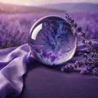
I think purple is the best color because it has a look that reminds me of how cool it is. I like pink, but I feel there's too much of that color. I see it every day, so it's starting to get somewhat boring. No offense to anyone who loves the color. It's just my opinion.
Purple should have more likes because it represents a lot of emotions. If you look on Google, you'll find that it represents many things, while pink only represents a few, like love.
Purple is such a gorgeous color. It has been my favorite color since forever. Purple is so aesthetic, mysterious, and deep. It contains so many emotions in one. This color will never be boring to me. If you don't like purple, that's fine, but you have to admit it's an amazing color. To me, it will always be the best.
-
Blue
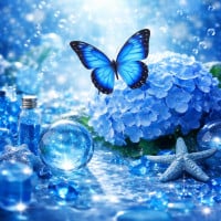
This is the most beautiful color I've ever liked. One reason that compels me to vote for it is that it's the color of the oceans, the seas, and the sky. It also covers half of the Earth's surface.
This color can also be used in many different items. It can be the color of your shirt, your hat, or even your jacket. This is precisely the best color.
Blue is simply spectacular. Any shade of this color is pleasant. Light colors give a calm and serene vibe, while dark colors convey a strong mood.
This incredible color has a safe and relaxing feeling. It's amazing that a color so commonly associated with sadness can bring so much joy.
-
Red
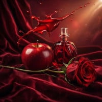
I used to like red, but now I like yellow. However, whenever I see something red, my mind says, "Oh, cute!" I love how it expresses a lot of emotions. People often say, "The sky is blue, it's pretty. The ocean is blue, it's pretty." Guess what? It's not blue! I honestly feel ashamed of people who say that red is ugly.
I only started liking yellow because I began using it frequently. So, thank you to the people who voted for red. Red can even express how you feel when you're jealous because we're calling blue ugly.
Red is a color that represents many things. When people think of love, a concept that is very beautiful to many, they often think of red. The same goes for anger, another emotion that comes to mind when looking at the color red. Red is a powerful color and should not be relegated to second place because of blue.
(Also, if you look at the comments for blue, they all sound like they're from 6-year-olds compared to the comments for red. Red supporters are true intellectuals.)
-
Pink
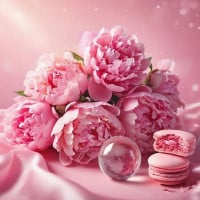
I think pink is a nice, bright color. However, it can be festive on cakes or at birthday parties, and 90% of girls loved this color when they were young! I love this color because it can be beautiful in any shade of pink. It will look amazing on your school supplies, backpacks, PE gear, water bottles, and much more.
Pink is a very nice color. When I see pink, I think about cuteness and sweetness. It's a well-known girly color, but I don't care. Even if it were considered a boyish color, I would still love it so much. Pink is my sixth favorite color.
-
Green
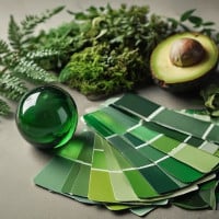
Green is so beautiful. It is one of the main four colors and the only one that's not a primary color. It appears on every plant and in the plumage of many birds.
It seems that even God must love green. With its various shades - Great Green, Gracious Green, Godly Green, Gorgeous Green, Ghostly Green, Groovy Green, Garden Green, Gallant Green - it is truly a wonderful color.
Green is just amazing. I don't like shades of green that resemble puke or are too bright. To me, green is a calm, peaceful color. I love the shade of green on leaves when they are in sunlight. It's just wonderful.
Green makes me think of peace because grass is green, and grass is almost always peaceful. I just love green.
-
Black
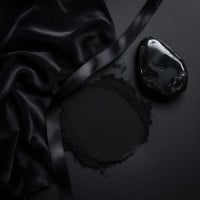
The sexiest color of all time. Some people don't understand the beauty of it. Only those who lack courage find it scary. Everything in black looks so mysterious and sexy. People with black hair and eyes, paired with pale skin, are incredibly attractive.
I like black. It is mysterious, dark, and sexy at the same time. It's a soothing color. I don't know why, but black has a different type of appeal. While blue may be everyone's favorite, black is for intellectual people.
Black goes with everything. It is always good for setting the tone. There is not a color that looks bad with it. As a fashion and design major, I always find it important to have black fabric, as it elevates any look.
-
Orange
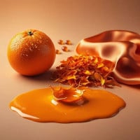
Orange makes me feel confident, and I believe it is the most beautiful color. I'm sure of it.
It's a bright, beautiful, rich color. It lifts my mood. My favorites are green and orange.
The color of the Dragon Balls and also of Goku's Turtle Hermit gi!
-
Cyan

Cyan is absolutely amazing. It's my second favorite color after green. The only reason for this is because I've never seen true cyan. Cyan is amazing, but when you look at true cyan, you have to say wow. It's amazing! I feel like it should be higher on the list, but thank you everyone for voting.
Cyan is honestly the best color ever. I call it "The Cooler Blue." Its bright, fluorescent texture is very awesome. I used to like blue, but later, I realized that blue was too common, so I picked cyan as my favorite instead. I always love playing as cyan in Among Us.
-
Yellow
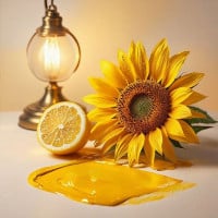
Yellow is just so pretty. It makes me think of the song Happy by Pharrell Williams, and we all know that song is happy! Get it? The song is called Happy. Jokes are never funny when you explain them, right?
Back to the color: it's also the color of the sun! Who doesn't love sunny days? That's really all I have to say. I love yellow!
Honestly, yellow is just such a beautiful, bright color, and it looks good on everyone. It is just so aesthetic and is definitely my favorite color. It puts a smile on my face every time!
-
Gold
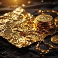
I love gold. It reminds me that we can always be better, just like how gold is tried by fire.
Gold is a rich type of yellow that brings wealth to everyone.
I think gold is a fascinating color, as it is my personal favorite!
-
?
Sapphire
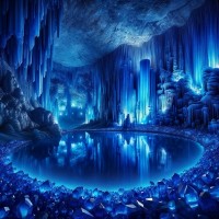
Although you can't see this color, if you've ever seen the gem, it can make you see beauty in a bright way!
I am sad I cannot see this color, but trust me, it's one of the greatest colors you will ever see!
I can't see it, but its color on the gem is amazing!
-
?
Ruby Red

Ruby Red is so captivating and pretty. I love how sweet it looks, like a super pretty cherry? I don't know. I just love it.
Rubies are my birthstone, and ruby red is a very lovely color. It's like cherry red with a small drop of purple.
There's just something about this shade of red that I can't take my eyes off of.
-
Silver
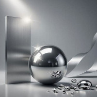
Silver is a beautiful color! It's the shimmering reflection of a lake at night, the moon that is the only light to guide weary wanderers at night, and the powerful wolves with their shimmering coats that prowl through the dead of night.
It is one of the rare eye colors and is very mystically beautiful. I think the only reason why people don't say it's attractive is because they don't normally see it.
This is pure beauty right there! So cool and so good! It's good for hair color or eye color. This shines! It should be number 1!
-
Midnight Blue
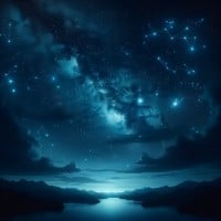
Okay, folks, look at this color. It is so mysterious, like it holds the world's secrets in it. It's like a color you know you can trust, like the night sky as you whisper your secrets into it before you go to sleep.
Midnight blue is very nice. It's just like navy blue. Usually, I would see a difference between them, but I think they're the same color with different names. Midnight blue is my tenth favorite color.
I like Midnight Blue because every time I see this color, it reminds me of the stars and looks like a wonderful night to celebrate parties.
It also reminds me of space.
-
Turquoise
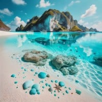
Turquoise is something I can feel the salt and sea water blowing off of. It's so fresh and awesome. Beach vibes all around.
Turquoise is such a pretty color. The sea, when it is clear, looks like this color, and it is ever so lovely.
Turquoise is so cool. It reminds me of the ocean in tropical places. Turquoise is definitely my eighth favorite color.
-
Violet
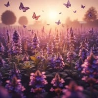
Okay, violet is basically a shade of purple, and purple is my favorite color. This color deserves respect. I wouldn't call it gorgeous - not because it isn't - but it just doesn't seem to be the right word. It reminds me of lavender. Instead of hypnotizing me, it almost seems like a trusting friend.
Violet is absolutely beautiful. I cannot explain how magical this color is to me. It is my favorite color of all time, and it is so magnificent. I look at it, and I feel so much better. This is a spectacular color, and I cannot put it into words.
-
Lavender
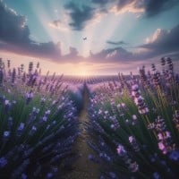
When I look at the color lavender, I think of the flower called lavender with its soothing scent. Lavender is like light purple with more blue. This color is my third favorite color.
Lavender is my favorite color because it's so versatile. You can use it for so many things, and it is very pleasing to the eye. Lavender is also my favorite flower, so it makes it even prettier in my eyes.
I love lavender. It's just such a beautiful and calm color. In my mind, lavender represents calmness and wisdom.
-
Aqua

Aqua is so nice. It's almost identical to cyan, which is my favorite color, except it has more green, and cyan is brighter. Also, it reminds me of turquoise, except turquoise is a bit more dull. Aqua is my second favorite color.
Aqua is the improved version of green and blue. It's such a tropical color. The ocean looks beautiful when it is an aqua color - I want to swim in it right away.
Sea green/Aqua is beautiful in every way. Green and blue have always been a little too bright for me but this is perfect. It reminds me of the coral settling under the ocean.
-
Blood Red
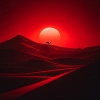
It's a cool shade of red that reminds me of fear.
It looks like it could be used in a horror movie.
Ah, yes, blood red is used for gory speed paintings and is a color that I think would look great in horror movies!
-
Scarlet

Scarlet isn't too bright, but it's not too dull either. It's just in the middle, which makes it a good color. Like a reddish-orange but lighter, it calms me.
Yes, it is beautiful, rich, and deep. It is a color that many find beautiful.
It's just a mix of red and orange. I don't like red, but this color is beautiful.
-
Indigo

This color is so dark and deep that I really like it. It's very similar to midnight blue, and like midnight blue, it holds all the secrets. Something about it being so dark is very calming.
Indigo is a very fancy color. It reminds me of midnight. It's a very close color to midnight blue, except indigo contains more purple. Indigo is my seventh favorite color.
Indigo is such a nice color. It's close to my favorite colors, which are basically a bunch of different shades of purple. It's beautiful.
-
Magenta
Magenta is just like pink with a touch of purple. It reminds me of certain flowers and of late spring. This color is my fourth favorite color.
Magenta is the best color ever. It doesn't make me think of any unpleasant associations, unlike yellow.
Magenta is actually very nice. I'm not exactly a big fan of it, but it's sweet.
-
Viridian Green

This is my favorite color. It just reminds me of some of the plants in Australia. Some people don't like it because they think it looks gross, but I see colors a lot differently from most people.
And finally, Viridian Green, my fourth favorite color (after Turquoise, Aqua, and Cyan). This is one of the best shades of green! The second-best shade of green, in my opinion, is Lime.
Viridian green is the best color ever. It doesn't remind me of anything inappropriate, unlike yellow.
-
White
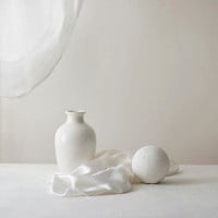
My favorite color is white. It's simple but beautiful. If white were a person, I think they would be beautiful but cold, unkind yet at the same time sweet and quiet. Anyway, I love this color along with black and silver.
White is pure and bright. It's a fresh dusting of snow that cleans the Earth once more. It symbolizes a clean slate, a fresh start, new beginnings, and all things pure and good. It is the color of truth and light.
White is so smooth and plain. I love it. It can be used for so many different things, and it goes with everything too.
-
Amber

Amber is one of my most favorite colors. It must be higher on the list.
Amber is for geology but still kind of looks like gold.
Amber is just awesome. Fight me.
-
Teal
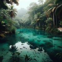
One of the best colors that brings joy to people because it is calming.
-
Maroon

Maroon is so elegant that who can say no to it. I love it. My friends and I used to draw pretty designs on each other's hands with gel pens, and one of my two friends I did it with had dark skin. I decided to use a glittery maroon on her hand and it was so beautiful that she kept it on for the rest of the day. In short, love it.
In my opinion maroon is one of the prettiest colors and it's also one of my favorite colors.
It's my all-time favorite color and it holds so much meaning to anyone who stares at it.
More Info
What makes a color beautiful to people?
Beauty in color is part instinct, part experience, and part context doing its little backstage routine. Some colors feel pleasing because they are linked to things humans have historically depended on or enjoyed, like clear water, healthy plants, warm sunlight, or ripe fruit. Your brain is not just seeing color. It is attaching meaning to it at high speed.
That said, beauty is not locked inside the color itself like some tiny crown. A shade can look amazing in a sunset and awful on a waiting room wall. Saturation, brightness, contrast, memory, and personal taste all get a vote. So when people argue over the most beautiful color, they are not just arguing about pigment. They are arguing about feeling.
Why do some colors seem calming while others feel intense?
Part of it comes from association. Soft blues and greens are often linked with sky, water, and plant life, so they can feel peaceful or steady. Bright reds and oranges are tied to heat, fire, blood, urgency, and movement, so they tend to feel louder. Your nervous system notices that fast.
Brightness matters too. A muted red and a blazing neon red are not giving off the same energy at all. One says elegant dinner party. The other says clearance sign having a breakdown. The emotional effect of color is not just about hue. It is also about how light or dark it is, how vivid it is, and what sits next to it.
Are ideas about beautiful colors the same in every culture?
Not even close. Some color meanings show up in many places, but cultures often assign very different values to the same shade. White can suggest purity in one setting and mourning in another. Red might signal luck, celebration, danger, passion, or power depending on where you are and what tradition you are looking at.
That is part of what makes this topic fun. A color is never just a color. It carries history, religion, fashion, politics, ceremony, and social habits along for the ride. So a “beautiful” color in one culture may feel ordinary, loaded, or even unpleasant somewhere else.
Is there a biological reason humans prefer certain colors?
There might be, at least in part. Some researchers think humans are more drawn to colors that once signaled useful things in the environment, like blue for clean water or green for fertile land. Colors tied to safety, food, and healthy surroundings may have had an edge because they were helpful long before anybody was debating paint chips at a hardware store.
But biology is only one piece of the puzzle. Culture, age, trends, personality, and memory can all override any built-in leaning. You might love a color because it reminds you of your childhood bedroom, your favorite team, or that jacket you wore when you thought you looked unbelievably cool. Science can explain some of the pull. The rest is personal chaos, which is very on-brand for humans.
Why do darker colors often seem elegant or powerful?
Dark colors tend to feel heavier, more dramatic, and more controlled. Black, deep navy, charcoal, and rich burgundy often look polished because they simplify what you see and give things visual weight. They can make an outfit, room, or design feel serious without trying too hard.
There is also a social side to it. Luxury branding, formalwear, and high-end interiors have leaned on darker tones for ages, so people connect them with sophistication. Sometimes a dark color looks beautiful because it truly is. Other times it looks beautiful because centuries of fashion and status symbolism have been whispering in your ear.
Why are bright colors so appealing even when they are not subtle?
Because subtle is not always the assignment. Bright colors grab attention fast, and your brain is built to notice strong visual signals. That can make vivid shades feel exciting, energetic, playful, and alive. A brilliant yellow or electric blue is not trying to blend in. It kicks the door open.
Bright colors also do well in memory. They stick. That makes them powerful in art, advertising, sports, and pop culture. Even people who say they prefer softer colors often have at least one bold favorite lurking in the background, waiting for its moment like a drama queen in sequins.
Can a color be beautiful even if it is unpopular?
Absolutely. Popularity and beauty are not the same thing. Some colors lose points because they are hard to wear, tricky to decorate with, or tied to ugly trends from the past. That does not make them ugly forever. It just means they need the right setting and a little luck.
Sometimes an overlooked color becomes stunning once it is paired correctly or seen in nature, fabric, lighting, or art. Olive, mustard, rust, and slate all have fans who will defend them like family. And honestly, good for them. A color does not need universal approval to be beautiful. It just needs to hit the right eye at the right moment.