Best Logos Designed in the 1970s
Here are the best-designed logos from the seventies, and they widely differ with design aesthetics, such as simplistic and bold. The Nike swoosh is highly ranked for being one of the best logos on this list.
The iconic swoosh is a logo for Nike, and it has become known as one of the most recognizable brand logos in the world. The swoosh was designed by Carolyn Davidson, which took 17.5 hours on creating the Swoosh. The company paid her thirty-five dollars.
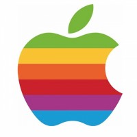
Designed by Rob Janoff, it was originally a six-color rainbow variant logo designed in 1977, but it was changed to a black version in 1998. The design remains unchanged, and the iconic Apple logo is one of the most recognizable.
Wow that logo looks a lot better than the new one.


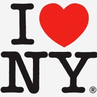
The state of New York was going through rough times in the seventies, with crime reaching an all-time high. In 1977, the New York State Department for Economic Development hired Wells Rich Greene to develop a marketing campaign for New York State, and the "I Love New York" logo was later introduced that following year as a promotion of tourism. The logo was designed by Milton Glaser.