Top 10 Scariest Logos of All Time
Being logo fans, we all must agree there are some scary ones out there.
-
THX (1983-Present)
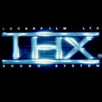
In my high school media class today, we were analyzing aliens, and the teacher then turned the volume up to 100%. I have tinnitus, by the way. He clicked play (jeez, the menu was already creepy). Then came the sound: aaaooeAEEEeeeh! One of my classmates then shouted, "Thanks a lot, George Lucas," as we all covered our ears. Seriously, it was that loud. The class next door asked us to turn it down because it was shaking her whiteboard.
This logo also appeared when I was playing Star Wars: A New Hope on my computer. I accidentally hit play while I was doing a Google search. Smash! Aeh! RIP my ears.
This is the only one that scared me. I'm not really scared of it anymore, but when I was little, it would always scare the heck out of me. Whenever I watched Monsters Inc., Cars, or The Incredibles, I'd skip it in the scene selection.
-
BND Face (1990-2002)
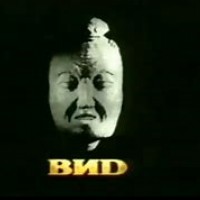
A white screen appears. A drill sound is in the distance. A white stick bounces back and forth. A ball bounces and falls. The screen turns black, and a face appears. This was scary to me and still is to this day. Damn!
I watched this logo when I was 10 years old. I heard the song at 9. I almost peed myself when I watched this. It is scarier than that Oz logo, which stares at me with the woman's head.
Despite me voting for this, I'm not scared of it at all. This is just the one that scares most people. Also, the BND mask in long-behavior-card-day YouTube videos is the worst scary logo.
-
Klasky Csupo "SSF" (1998)
Funny and scary at the same time. When I was about 8, I rewound the logo. It's in random Sparta remixes.
You guys haven't seen the 2003 version. Dear God, that one's bad.
I remember seeing this at the end of a SpongeBob SquarePants episode.
-
Viacom "V of Doom" (1976-1986)
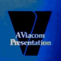
This is especially true if it is on damaged film, where the sound warps so badly.
I'm not afraid of any version except the Ultra Dark and the Uber Dark versions.
The V in the logo is not scary, but the music is so loud.
-
Screen Gems "S from Hell" (1965-1974)

I used to not be afraid of this logo. Eric Siday did a pretty good job with the music. But after watching that stupid S from Hell documentary (it was just the trailer, but you get the idea), I was scared for life.
Is that supposed to be the all-seeing eye in the middle?
I got seven years of nightmares from this logo.
-
Stretch Films "Teeth" (1998)
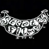
Why does this logo appear at the end of an episode of Courage the Cowardly Dog?!
I used to hide and cover my ears. At least it was scary for me!
That logo is creepily unsettling. That laugh was scary.
-
BBC "Streaks of Doom" (1990-1997)
If I had grown up in the UK during the '90s and this came up, I would have easily been freaked out.
-
Gorgon Video (1982)
The V of Doom was shown when watching BND face masks of 2020.
-
DreamWorks "Shark Tale Moon" (2004)
-
Horror Factory (1980s)
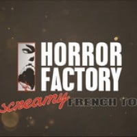
At least, I didn't watch this logo.
This logo is the worst company logo I've ever heard of. The logo starts with a sepia environment, with particles flying everywhere (it looks like the intro of Call of Duty: Advanced Warfare). There's also a figure in the distance! As we zoom in, it turns out to be a skinless, goblin-like humanoid creature. It lifts its head up, screams, and then drops down. Then we see part of the logo, which features a disturbing grey drawing of a screaming mouth with a bloody lip!
But wait - it gets worse! Just as the logo is about to finish, the creature from before lunges up and screams at the viewers, then goes back down. Just seeing that is horrible and scary, and it makes us shriek in horror! Not only does it creep everyone out, but it also feels like abuse!
After that, the white, bold text "HORROR FACTORY" appears next to a rectangle, and the text "THE Screamy French TOUCH" appears below the logo. It is accompanied by horrible, cringe-worthy sounds, like a woman screaming (which is ear-grating). Then the logo disappears after a few seconds.
I can't believe this logo exists! Do not watch this logo! It will scare the lives out of you!
-
?
A.K.A. Cartoon (1994)
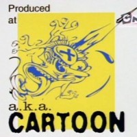
Have to add this becuz this logo is basically the reason why a lot of kids back in the day skipped over the end credits of Ed, Edd 'n' Eddy. Gory, scary, graphic... Imagine getting a nightmare over this.
-
?
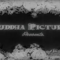
Buddha Pictures (1999-2001)
-
Valve "Pump in Head" (2007-Present)
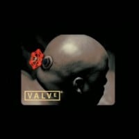
This one is more eerie than scary. The animation and the head turning really give you that chill.
-
United Artists (1982-1987, 1994, 2004)

-
Boje Buck Filmproduktion "The Rabbit" (1993)
The rabbit comes in almost like a jumpscare. Its smile is almost as creepy as Oz Film Manufacturing's creepy smile. And don't even get me started on the dark version!
Steve Irwin found out his pet snake had been bitten by a venomous rabbit.
This logo is creepier compared to BND/VID, Team Happy Rainbow Panda Bears, Viacom, possibly THX, Screen Gems, Big Ape, Klasky Csupo, and Oz Film Company. This is the 3rd scariest logo ever. It shows a non-binary (possibly male) rabbit looking at us, possibly eating a big snake. When zoomed out, it reveals there is a second bunny who stands behind him, who looks less scary.
The dark version, or the black and white variant, is worse. It shows only the rabbit in a black and white background, zooming in like the original. However, the words are black and white, not black and red, and the second rabbit is missing or absent. This version with no music is scarier.
Don't worry, guys. The 2009 version is less scary. The rabbit looks scary, but the snake is absent and replaced by a sausage or a big carrot. The music is peaceful, crickets are chirping, and there are bird sounds. There is also a field of grass either hiding the snake or not. The background music is calming. This variant has a blue streak, and the 2nd rabbit is missing. The rabbit dressed like a soldier eating a snake is kind of creepy, but better than the last two variants. By the way, his ear twitches. Not to mention, this is silent, along with the black and white and original versions. This is in Germany, not America. It would be funny if you put Cannibal by Ke$ha over it. It would be less scary on the regular, dark variant, and soldier variant.
PLEASE STOP LOOKING AT ME WITH YOUR CREEPY LOOKING EYES. - Appleferguson2008 Made In: 5/7/21
-
Team Happy Rainbow Panda Bears (2011)
Torture. One of the worst nightmare logos ever.
Animal torture, but I actually got close to it.
-
Saban (1984-1988)
Saban was still going when Glitter Force (2016) came out. By the way, 1st or 2nd ain't scary.
-
United American Video (Late 1980s-Early 1990s)
-
WGBH Boston (1993-Present)
-
Paramount "Closet Killer" (1969-1975)
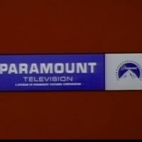
It is scary but funny when you pair it with the theme from Psycho.
It comes out of nowhere and just zooms in for no reason.
-
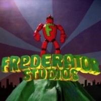
Frederator "Drill Robot" (2009)
-
WGBH "Short Version" (1977-1993)
-
Oz Film Company (1914-1915)
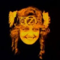
Even though BND was scary, this takes the cake. Basically, the screen fades to a woman's head floating, wearing an OZ crown. She has pigtails. It stares at you in the beginning, starts smiling, and looks around. There is some violin music, and it just fades to black. This should be number 1.
This doesn't just scare me. It gives me nightmares of her giggling. I don't know the woman's name, but dang, she is so creepy. The logo must be made from hell. I'm really scared. I love God more than this abomination. I just want this logo out of my thoughts. It's probably 106 or 107 years old.
Why isn't this number one? For once, a real person actually terrifies me. Don't even get me started on the close-up variant.
-
Bravo "Screwhead" (1997-2001)
-
Hill Country Hearing "Half of a Head" (2015)
-
DiC "Chorus from Hell" (1987)
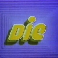
The kid in bed scared the bejeezus out of me. I have nightmares of this even as an adult!
-
MGM Television (1960-1961)
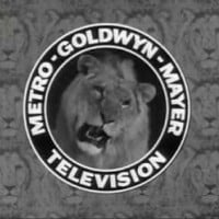
I'm also born in August.
Yeah, only the 1960 and 1961 versions, along with the other black-and-white versions, scare me. The colored version isn't creepy. Goldwyn Pictures isn't creepy either. It just looks like this lion.
Oz Film Company takes the cake for the scariest logos ever.
Scared me after watching The Grinch when I was only single digits (0-9, but not at 7, 8, or 9).