Top 10 Cheesiest Logos
Welcome! Let's talk about the wonderful world of closing logos. Typically, logos don't really look all that bad. Sometimes, they can be more interesting than the actual show or movie the company produced.
But looking back at them, you realize that some of them look horrible! While most of these logos will make you shudder in cringe, others are so bad they're good. These logos include film, video game, and television logos.
And if you like these logos, that's fine! Since TheTopTens is opinion-based after all, and the logo's creator might just appreciate it. With that said, let's go!
-
The Video Bancorp (1990)
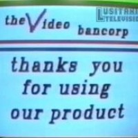
If you're familiar with these kinds of logos, you basically know that Video Bancorp would be number one without even clicking on the list! This logo wouldn't be as bad as it is if it weren't for the text saying, "Thank you for using our product!" That's what it literally says.
Not much is known about the logo, other than the fact that it mostly appeared on public domain Popeye VHS tapes. One tape in particular even had hardcore pornography on it. So not only is the logo cheesy, but the company is rather strange too. Talk about out of context.
That's kind of embarrassing. "Thank you" for making this list! I think what it actually says is, "The Video Bancorp thanks you for using our product," which is less cheesy but still dumb.
-
Family Home Entertainment (1981)

Next up, we have a somewhat cheesy logo from the '80s. The music sounds really unappealing, and the text at the end looks really unreadable. Family Home Entertainment? More like Family Home Disappointment, am I right?
First, we see a purple "star" zooming in toward you, Viacom V of Doom-style. But at the last minute, the star shapeshifts to "Family Home," with "Entertainment" appearing below in a pretty ugly font. Contrary to its name, FHE also released some adult films in the early '80s before USA Home Video's formation in 1982.
-
L.A. Hero (1992)
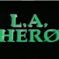
Honestly, this is the worst anime logo out there. Firstly, while the music is relaxing (but annoying), what really makes the logo cheesy is the animation. All it consists of are flying letters that look like they were made in PowerPoint. Plus, the red "sun" (possibly FHE's cousin) is poorly made and unneeded.
-
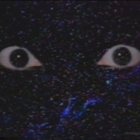
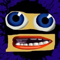
Pony Canyon (1989)
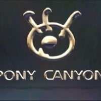
Okay, so now we've gone from the cheesiest of the bunch to the most bizarre. First, we see an eye that zooms in, then some creepy face (which may or may not be PC's mascot) appears, laughing but then crying. Then a whole bunch of nonsensical things occur. This logo, while not as bad as FHE, is still pretty cheesy and pretty creepy too.
-
PBS (1971)
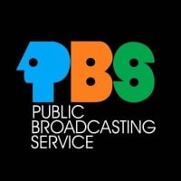
Oh yeah, I forgot how cheesy this one was. While it's not as cheesy as Pony Canyon's logo from 1989, it's still really cheap. But then again, it's 1971. What did you expect?
-
Vadi-mon (1982)
Stupid name aside, this logo has poor animation. The music feels super depressing, and the eyes at the beginning of the logo seem really out of place. Also, the disintegrating planets feel out of place for a home video logo. The eyes at the beginning are probably the most random element here.
The final scene where the logo zooms in is the cheesiest part. But I really love this logo, though.
-
Cookie Jar Entertainment (2004)

My main issue with this logo is that it's seen everywhere and is very forgettable. It also plasters nearly every previous logo of the studios Cookie Jar has acquired. Even the iconic DiC "Kid in bed" logo couldn't save itself from the jar of evil. But in all seriousness, the logo doesn't really look like a jar, and it consists of a bunch of kids yelling the logo's name. The WildBrain logo from 2019 is far better.
-
Sega (Argentina) (1990)
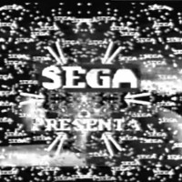
No, this isn't the video game company we all know and love. The Sega I'm talking about is actually an Argentinean VHS distribution service, similar to CBS/Fox Video and Family Home Entertainment. Firstly, the quality of the logo is notably poor. It has very cheap CGI models, worse than those found in Pony Canyon, and the logo is in black and white. At least the other logos on this list are in color. The creepy music doesn't help with the tone of this logo either.
Also, speaking of Sega, I can't wait until someone forms a VHS company named Nintendø or a DVD service named χbox!
-
Zombastic Productions (2001)

Oh boy, where to start with this one? The logo is illogical. First, we see a flying skull in space as a hand fills a syringe with a pink substance. Then, the substance goes into the skull. As soon as that happens, the skull opens its mouth with the cheesiest frame movement ever and screams (I find the scream "so bad it's good"). Once that ends, the logo appears. After the logo ends, the skeleton returns, but now it's bleeding as it disintegrates. That was something.
-
Burger King (2021)
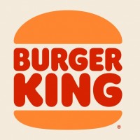
Oversimplified logos. While simple and memorable logos like the 1996 Warner Home Video logo or the Windows 10 logo are memorable, this one is just forgettable, if anything.
A forgettable logo made by a bad company.
-
?
Photo Video (1988)
-
?
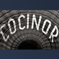
Cocinor "Tunnel of Horror" (1957)
-
Telemundo (1997)
-
Walt Disney Home Video (1992)
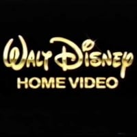
To be honest, this logo shares a similar problem with the Cookie Jar Entertainment logo: it's seen everywhere. Additionally, there's not really any animation, just golden text shining. The logo worsens when you compare it to the next and previous Disney logos. The one from 1986 features Mickey, their mascot, while the 2003 version is short, simple, and memorable.
Then there are the variants - so many variants. One variant from 1995, in particular, is just blue generic text. It highlights the decline in Disney's overall quality after Toy Story and The Lion King.
I would agree. This is lazy, especially compared to the UK version, which was CGI and looked like a Disney World road sign.
-
KWSU (1976)
Yet another cheesy logo from the late 70s/early 80s. With this logo, we have ear-grating music that sounds like an Atari system dying. Additionally, the KWSU logo doesn't really look like a KWSU logo. It looks like it says CWUV instead.
I don't know why this exists. I need help.
-
MTV (1981)
To be honest, this is the best-looking logo on the list. It didn't overshadow objectively better logos, and it didn't invade our personal spaces.
-
FADYO (2021)
I forgot about this hot garbage. This logo is a lawsuit waiting to happen as they stole music from The Beatles. Not only that, but they also took the Universal Studios logo from 1990. The editing in this logo makes the 1981 FHE logo look good by comparison. Why couldn't the spam-voters focus on this instead of the 1971 PBS logo? At least for that one, it was understandable since it was from 1971. But this logo is from 2003, which is unacceptable.
-
UNC TV (1971)
Oh yeah, I forgot about how cheesy this logo was.
On a black background, this weird filled-in text of blue and green comes in from out of nowhere. This weird harpsichord music starts playing. The logo spreads out, then the "presents" text comes in with the same cheesy text and colors.
-
Warner Bros. (1972)
-
PAP Video (1986)
-
Summit Entertainment (2018)
-
Boyd's Video and Video Films (Early 1980s)
-
Viacom "V of Doom" (1976)
-
Klasky Csupo (1991)
-
Bryanston Pictures (1972)

-
National Educational Television (NET) (1960)
-
Rex Films Home Video (1980s)