Top 10 Worst Colors
Colors have a powerful way of making us feel things, both good and bad. Some paint combinations are a feast for the eyes, while others are total assaults on our senses.
These are the shades that made your eyes bleed in art class, clashed horribly with your favorite outfit, or maybe just bring up unpleasant memories. Picture that putrid pea soup green or a sickly highlighter yellow that practically burns your retinas.
-
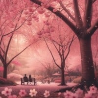
Pink
Pink just tries to make colors like orange look bad, which is just stupid. I don't even understand where the hate for colors like orange comes from. Orange is the color of the evening sunset, which is beautiful and shows some of the beauty of nature. In autumn, the leaves can turn orange. It is a lovely sight and shows that autumn is a season of beauty.
Where on earth do you even spot pink? I can't imagine anything in nature being pink. Pink leaves? Pink trees? It would look so weird, so out of place. Even the picture here looks weird to me. The color just doesn't give me a sense of nature.
When I think about this color, all I can think of are Disney princesses and house decorations. But that's it. It's not even a surprise that so many people dislike it.
Now, let me just tell you, I don't necessarily hate the color. I just dislike it. And it's just an opinion. So don't start attacking me. It really isn't needed here. I respect your opinion if you like the color. Just respect mine too.
-
Puke Green

I don't like puke green at all. It is seriously gross, and it makes you feel like throwing up. It is very, very disgusting. I do like normal green, but totally not this. In my opinion, this is the worst color ever on the color palette.
The uncanny color (the one in the image) is green but never encountered in nature. It is never used except in old people's houses, old chemistry textbooks, and outdated CGI, and for a good reason. It is uninspired.
I hate every kind of green except emerald green. This is no exception. This color is so ugly and so much worse than pink. Pink doesn't deserve to be first, or anywhere on this list. Green does.
-
Yellow
This is the ugliest color ever, in my opinion.
Why does everyone hate green? This color is way uglier than green. Some people probably like it because they like dirt.
I have tried an experiment. Dirty your finger slightly, then get a white paper and rub it. The rubbed spot might turn yellow, so it's the color of dirt.
Simply a bad color. This is the only color I voted for. It is just worse than every other major color group.
There are about three acceptable yellows, and every color mixed with yellow becomes worse.
-
Brown
I cannot believe that this color is not number one on this list. Poop brown is a terrible color! Also, pink is a nice color and does not deserve to be at the top of the list!
I really hate brown. Even though my eyes are brown and my hair is black, whoever put this on the list was right. It is the worst color. Yeah, brown is the worst color. It's true.
It's the color of poop. Sure, brown is a good color for furniture, like tables, bed stands, and nightstands. That's pretty much it. Brown isn't good for anything else. Ugly color.
-
Pee Yellow

I like colors. In fact, I like almost every color there is! There are only two exceptions, and this is one of them. The only time I've ever used this color is when I used a yellow marker on top of a black marker and was forced to keep using it since it was the only yellow I had. So not only is it a gross color, but it also brings back sad childhood memories.
I saw this colour for the first time when I was using those cheap felt tips and accidentally got the yellow and black too close. I wanted to rip my eyeballs out that day from how disgusting this colour is.
-
Gray

If you look at stores like in the 1990s and early 2000s, stores had so many colors. McDonald's was red. A local grocery had a rainbow. Wal-Mart had darker blue. Taco Bell had like a green/yellow/red. A local Hardee's was like medium blue and red. Burger King had a blue/red.
Now, all of them have plain grey color. It's as if the store went out of business and took their signs with them when closed. You could tell what business it was. Now everything is bleak gray.
Even the insides of fast food restaurants felt like they had more color. It wasn't all stores, but modern day everything feels bland and grey.
I don't mind grey skies. I love them. But it's nice to have much more color.
-
Mustard Yellow

My favorite color is yellow. But Mustard Yellow is hideous. I don't even like mustard. And this shade makes me hate yellow.
This picture isn't a good representation of Mustard Yellow, but I find Mustard Yellow to just be ugly.
I hate mustard. I hate yellow. This is a hideous chimera of the two, a sin against both man and God.
-
Olive Green

Olive green is the color of vomit, pee, and poop combined.
Not a very pleasant color for the eyes, that's for sure.
This is like a darker version of yellow-green, and either way, yellow-green is completely disgusting. This is hard to look at.
-
Green
I have a saying when it comes to colors. It goes as follows: "It's better when brighter."
This is not bright enough. All cool colors really just kind of suck in my opinion.
Green is not a creative color. But it is still good as it represents nature and plants. The reason it's hated is because 70% of shiny Pokemon are this color.
Green is the worst color because it is the color used to represent sickness and toxic chemicals. Vomit and snot are green too.
-
Orange
Orange is annoying. It is awful when it is really bright, light, or neon, but it can be a good color when it is "burnt" or muted.
I hate the words used to describe other colors on this list. Brown is a beautiful color, I don't know why it gets such a bad rap among immature people. "Puke" isn't green, either. Beige is a lovely neutral color.
Disgusting, awful, the physical embodiment of horror. If dysentery was a color, it would be orange. I hate it so much. Only people with no taste like orange.
Orange is a horrible color. Yes, some orange things are nice. Well, duh. But for me, it's way too bright. It is one of the worst colors ever.
-
?
Pantone 448 C
Ugly color, and it should not have numbers in its name.
-
?
Dark Yellow
I was never a fan of colors that are too deep, and this is an example. This color kind of ruined yellow for me.
Is this yellow mixed with green?
I actually like this more than yellow since it's not as bright.
My favorite color is yellow, but this shade made me literally gag.
-
Purple

Out of the primaries and secondaries only, this is by far the worst color out of all of them. When I look at this color, I am not looking at a color, I am looking at a dark void with the saturation set to 300%. The only good thing about purple is that it can be used as a worse alternative to pink if you don't like pink's reputation.
I don't know how anyone could say that purple is nice. Tell me a purple thing that is good or at least useful for people. The only purple things I can think of are detergents, poison, and chemicals, Barney, and different harmful reactions and symptoms that could kill a person.
-
Hot Pink

Violent and unnatural, when I see it, it feels like it's violently attacking my eyes. I think the hot pink that's leaning towards red is fine because it's warmer, but the hot pink leaning towards purple feels like it's bleaching my eyes. I would say it feels icy cold but it's a different kind of freezing, maybe like dry ice. It looks like it's pretending to be warm to secretly burn people's retinas out, but not really pretending because it does such a bad job at it.
Hot pink is DISGUSTING. It's always associated with girls, and it annoys me that pink is the color always used for girls' toys.
Personally, I love red, and everyone always assumes my favorite color is purple or pink, which really peeves me off.
-
Puce

Oh my goodness, why? Puce is definitely not okay! Please tell me who made this color so I can hurt them. Puce is also the name of a bed bug, why... why name the color after the bed bug? Who decided to mash together brown and red and like a weird burgundy color to make this monstrosity. Please vote for this color so it can become the number one worst color... I swear this color makes my throat close up, good Lord.
What even is puce? Is it a bed bug? Lice? Google said it's a bug, not a color. It just said it's not green, and green is the color of boogers. And I mean, okay, I pick my nose sometimes because I have boogers sometimes, but that's nasty.
-
Beige

I really just don't like beige. Nothing much to it.
Also, guys, the most overrated color is blue. Like, literally, everyone in this generation loves it. When a teacher asks, "What's your favorite color?" Like everyone answers blue. Meh. I would say purple is the most underrated color but judging by the internet, that might not be true. Also, pink isn't as overrated as it used to be. It is the stereotypical color for girls, but meh.
I associate this with those people who can't make conversation, old people, hyperactive chihuahuas, and the Dust Bowl. I have mild synesthesia, and beige sounds like bad jazz music to me.
-
Yellow Gray
Yeah, I haven't seen many colors.
What the heck, how does "yellow gray" even exist?!
I hate Yellow Gray. It's so nasty looking.
What the... does "yellow gray" even exist?!
-
Blood Red

The color of blood is kind of disturbing, in my opinion.
I'm not a fan of this color. It looks like a shade of brown.
I have Hematophobia (fear of blood), and this scares me just by looking at it.
-
Neon Yellow
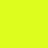
I usually like neon, but neon yellow is eye-blinding and screams at you. It only deserves to be with highlighters and art supplies, really, and neon art. Not much else of a purpose.
How is this not even considered Fluorescent Yellow? The only reason I hate it is because it looks like a yellow or chartreuse ripoff.
I'm usually partial to most shades of yellow, but this one is a monstrosity.
-
Tan

There's just nothing going on. It's just plain and simple, and I don't like that. It's like a hidden murderer.
Old bathrooms, pipe paint, iron bacteria. Weird. Make it just a little brighter, darker, or duller and it's okay.
Tan is such a bad color. It reminds me of vomit. Yuck!
-
Blue

Blue, oh how I hate it so much. Every time I see it, I feel like I am being tapped on the heart by a needle. It is seen so much that I have gotten used to the pain, but on some occasions, it hurts. I don't see how it is peaceful or calming. Blue should be at the top of the worst colors list.
Blue is also the most boring color. I love the sky, but why does it have to be blue? I believe that people who love blue love the sky and have said, "If the sky is blue, blue will be my favorite color!" Now, the color yellow should be considered the best, and then the color black. How could anyone hate it? Black creates a better image of high technology and is way more calming than blue. The only good thing about blue is that it helps make pink for pigs.
-
Gold
While many associate this color with first place, the only thing it wins at in my book is being terrible (well, besides the color that shall not be named). It's like if yellow and orange had a baby but remove everything good about orange. Then, take yellow's bad qualities and multiply them by ten. There, we've just made gold.
Gold just looks cheap and goes with colors like pink and that beige nobody likes.
Do you know "Old is gold"? Who in the world likes OLD?!
-
Hobo Brown
The name explains itself. The only good thing about this color is its application in nature and natural looks, but this is definitely a fan-made color.
Brown is a disgusting color, and hobo is a name for a poor person.
-
White

Boring! This color is literally everywhere! I like white if it is on dresses, but that is it. It is used on this website, on pages, and on paper. Use better colors, people!
It's boring and it's the most common color.
My art teacher agrees. Must destroy all white on paper with color!
-
Yellow Green

When I saw the words "Yellow Green," I thought, "Nice, a good shade of green." I was thinking about lime. This is neon green. After looking at the color, I thought, "Ok, who cranked the saturation up to 110 percent?"
Bad green. Give me back my lime.
This color confuses me. I know why it's called yellow green, but it's just warm green to me. Yellow makes me think of something bright and happy. This isn't light green, but warm green.
I colored my hair lime green and loved it, but as soon as you get to school people start calling you names. That was like three months ago, and I'm still being called the Grinch.
-
Light Gray

This color is kind of bland, honestly. I like bright and vibrant colors, such as red and blue. Colors like light gray never stood out to me.
It kinda looks like silver in a way.
-
Burnt Umber