Top Ten MLS Teams With the Worst Logos
This list compiles the ugliest logos in Major League Soccer's history.The Top Ten
1 Miami Fusion F.C. (1998 - 2001)
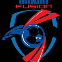 A former professional soccer team, Miami Fusion participated in MLS from 1998 until 2001. Based in Fort Lauderdale, Florida, the team folded due to financial struggles. They wore teal, black, and orange during their existence.
A former professional soccer team, Miami Fusion participated in MLS from 1998 until 2001. Based in Fort Lauderdale, Florida, the team folded due to financial struggles. They wore teal, black, and orange during their existence.
2 LA Galaxy (1996 - 2007)
3 Kansas City Wiz (1996)
4 Dallas Burn (1996 - 2004)
5 San Jose Clash (1996 - 1999)
6 New York City FC (2015)
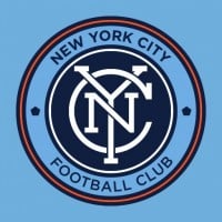 A Major League Soccer (MLS) team based in New York City, New York City FC was established in 2013 as an expansion team. They have quickly become competitive and attract significant crowds. The team's colors include navy blue, white, and orange.
A Major League Soccer (MLS) team based in New York City, New York City FC was established in 2013 as an expansion team. They have quickly become competitive and attract significant crowds. The team's colors include navy blue, white, and orange. Nyc fc is the best mls team the have pirlo
7 Colorado Rapids (1996 - 2006)
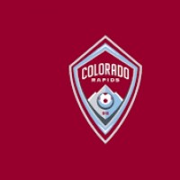 The Colorado Rapids are an American professional men's soccer team, based in the Denver suburb of Commerce City, Colorado.
The Colorado Rapids are an American professional men's soccer team, based in the Denver suburb of Commerce City, Colorado.
8 D.C. United (1996 - 1997)
9 San Jose Earthquakes (2000 - 2007)
10 Orlando City SC (2015)
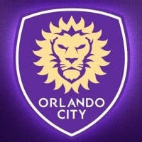 An MLS team based in Orlando, Florida, Orlando City SC was founded in 2013. The team has focused on grassroots development and has a passionate following. Their team colors are purple and gold.
An MLS team based in Orlando, Florida, Orlando City SC was founded in 2013. The team has focused on grassroots development and has a passionate following. Their team colors are purple and gold.BAdd New Item